Le 10 Migliori Soluzioni Dashboard Recensite Nel 2026

Miglior Software per Dashboard: La Shortlist


Il software per dashboard ti aiuta a trasformare dati complessi in informazioni visive chiare, così puoi prendere decisioni più intelligenti e rapide. Centralizzando tutti i tuoi indicatori e report chiave in un unico posto, ottieni una panoramica in tempo reale del tuo business—niente più ricerche tra i fogli di calcolo o dubbi su cosa sia davvero importante.
Ho testato i migliori software per dashboard pensati per i professionisti delle revenue operations, quindi analizziamo le opzioni migliori per aiutarti a scegliere quella giusta per le esigenze del tuo team.
Table of Contents
Why Trust Our Software Reviews
We’ve been testing and reviewing RevOps software since 2022. As RevOps leaders ourselves, we know how critical and difficult it is to make the right decision when selecting software.
We invest in deep research to help our audience make better software purchasing decisions. We’ve tested more than 2,000 tools for different RevOps use cases and written over 1,000 comprehensive software reviews. Learn how we stay transparent & our software review methodology.
Riepilogo dei Migliori Software per Dashboard
Questa tabella comparativa riassume i dettagli sui prezzi delle mie migliori selezioni di software per dashboard per aiutarti a trovare quello più adatto al tuo budget e alle esigenze della tua azienda.
| Tool | Best For | Trial Info | Price | ||
|---|---|---|---|---|---|
| 1 | Best with omnichannel identity stitching | Free trial + free demo available | Pricing upon request | Website | |
| 2 | Best for spreadsheet-native live dashboards | Free plan available | From $49/month (billed annually) | Website | |
| 3 | Best for marketing agencies | 14-day free trial + free demo available | From $44/month (billed annually) | Website | |
| 4 | Best for low-code dashboard creation | Free plan available | From $20/developer/month | Website | |
| 5 | Best for unified security and observability | 60-day free trial | Pricing upon request | Website | |
| 6 | Best for small businesses | 14-day free trial | From $120/month (billed annually) | Website | |
| 7 | Best for visual data analysis | Free plan available | From $15/user/month (billed annually) | Website | |
| 8 | Best for all-in-one business dashboards | 14-day free trial available | From $29/month | Website | |
| 9 | Best for SQL-based analysis | Free trial + free demo available | From $25/user/month (billed annually) | Website | |
| 10 | Best for mobile access | Free plan + free trial + free demo available | From $64/month (billed annually) | Website |
-

Prisync
Visit WebsiteThis is an aggregated rating for this tool including ratings from Crozdesk users and ratings from other sites.4.7 -
Expedite Commerce
Visit Website -
QuickBooks Online
Visit WebsiteThis is an aggregated rating for this tool including ratings from Crozdesk users and ratings from other sites.4


Recensioni dei Migliori Software per Dashboard
Di seguito trovi i miei riassunti dettagliati dei migliori software per dashboard che ho inserito nella lista. Le mie recensioni offrono uno sguardo approfondito sulle funzionalità chiave, i pro e i contro, le integrazioni e i casi d’uso ideali di ogni strumento per aiutarti a trovare quello giusto per te.
Adobe Customer Journey Analytics is a dashboard software platform for analyzing, visualizing, and exploring customer journey data across multiple channels and data sources.
Who Is Adobe Customer Journey Analytics Best For?
Enterprise analytics teams in retail, finance, or media who need to unify and analyze customer data from multiple channels.
Why I Picked Adobe Customer Journey Analytics
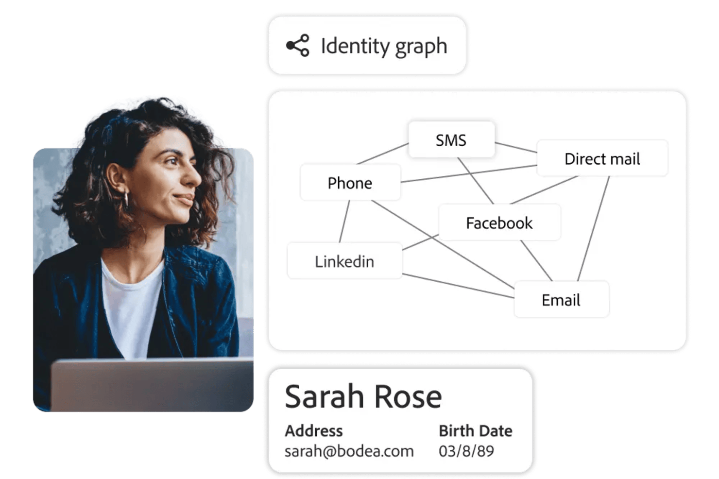
I picked Adobe Customer Journey Analytics as one of the best because I can unify customer data from web, mobile, and offline sources using its omnichannel identity stitching. My team is able to visualize complete customer journeys in a single dashboard, connecting touchpoints across channels. I also like how the platform lets us analyze user behavior with granular segmentation based on unified profiles.
Adobe Customer Journey Analytics Key Features
- Custom dashboard builder: Create and personalize dashboards with drag-and-drop widgets and visualizations.
- Real-time data streaming: Access up-to-the-minute data for live monitoring and reporting.
- Advanced calculated metrics: Build custom metrics using formulas and logic tailored to your analysis needs.
- Collaboration tools: Share dashboards and reports with team members and set permissions for access and editing.
Adobe Customer Journey Analytics Integrations
Adobe Customer Journey Analytics offers native integrations with Adobe Journey Optimizer, Adobe Real-Time CDP, Adobe Campaign, and Adobe Target. It is built on Adobe Experience Platform and provides an API for custom integrations.
Pros and Cons
Pros:
- Real-time anomaly detection in dashboards
- Advanced journey path and attribution analysis
- Omnichannel identity stitching for unified profiles
Cons:
- Limited native integrations outside Adobe ecosystem
- No transparent pricing or self-serve signup
For businesses and teams seeking a dynamic dashboard solution, Coefficient offers a unique blend of data integration and visualization capabilities. It appeals to professionals across various industries, such as finance, marketing, and operations, who need to transform static spreadsheets into interactive, data-driven dashboards.
Why I Picked Coefficient
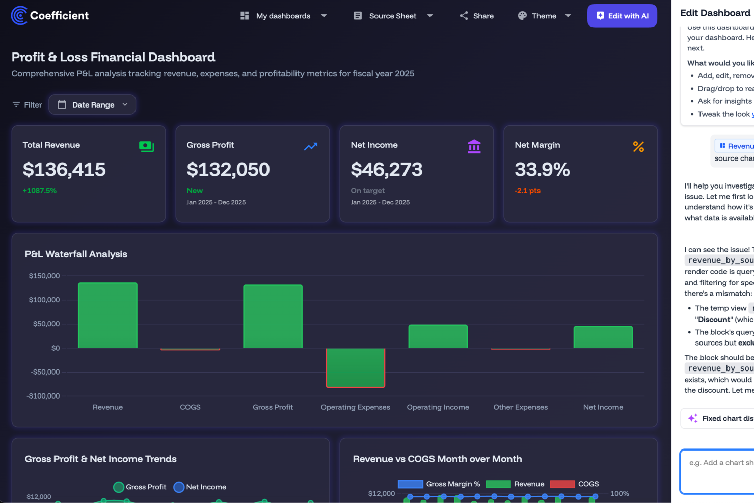
I picked Coefficient because it excels in transforming traditional spreadsheets into interactive dashboards. Its standout feature is the ability to connect Google Sheets and Excel to over 100 data sources, which allows you to build live dashboards with real-time data. Another compelling feature is its AI-powered data cleaning and transformation tools, which simplify complex data processes directly within your spreadsheets. This integration and automation capability make Coefficient an ideal tool for those who want to improve data accuracy and speed up decision-making without extensive technical expertise.
Coefficient Key Features
In addition to its integration and automation capabilities, I also found the following features valuable for dashboard creation:
- Interactive Web Dashboards: Create and customize dashboards that can be shared across teams, enhancing collaboration and data visibility.
- Automated Alerts: Set up notifications to receive alerts via Slack or email whenever data changes, ensuring you never miss critical updates.
- Pre-built Templates: Utilize a variety of templates designed for specific business needs, such as financial forecasts and marketing dashboards, to jumpstart your projects.
- Custom Connectors: Develop tailored connections to specific data sources, allowing for more personalized and comprehensive data integration.
Coefficient Integrations
Integrations include Salesforce, QuickBooks, Snowflake, HubSpot, MySQL, PostgreSQL, Redshift, Tableau, and more.
Pros and Cons
Pros:
- Intuitive sidebar interface for non-coders
- Simplifies complex SQL data pulls
- Offers real-time data syncing
Cons:
- Dependency on Google Sheets and Excel
- Basic data transformation options

DashThis is a reporting dashboard tool designed for marketing agencies to consolidate data from various sources into one platform. It simplifies the process of creating and sharing reports with clients, saving time and effort.
Why I picked DashThis: DashThis provides an intuitive platform specifically tailored for marketing agencies. Its automated reporting feature allows you to generate reports quickly without manual data entry, while its customizable templates help your team create visually appealing reports. Overall, DashThis is ideal for agencies looking to streamline their reporting processes.
Standout features & integrations:
Features include automated reporting that reduces the time spent on manual tasks, customizable templates that allow you to create professional-looking reports suited to your agency's style and an intuitive interface.
Integrations include Google Analytics, Facebook Ads, Instagram Insights, LinkedIn Ads, Twitter, Mailchimp, Moz, HubSpot, YouTube, and Shopify.
Pros and Cons
Pros:
- Tailored for marketing metrics
- Quick automated reporting
- Customizable report templates
Cons:
- Limited advanced customization
- Basic data visualization options
New Product Updates from DashThis

DashThis Adds Calculated Widgets for Cross-Platform Metrics
DashThis introduces Calculated Widgets for building custom cross-platform metrics. The new feature lets users combine metrics from multiple integrations, customize formatting, and display trends without manual calculations. For more information, visit DashThis's official site.
 .
.
UI Bakery empowers businesses to create dynamic dashboards and internal tools without extensive coding knowledge. Ideal for companies aiming to streamline operations and enhance customer engagement, this platform offers a user-friendly interface to integrate data and automate workflows seamlessly.
Why I Picked UI Bakery
I picked UI Bakery because it blends low-code ease with real control over data and logic, helping you build dashboards that connect directly to your databases (SQL, NoSQL or APIs) and let you visualize real-time data and analytics. Its drag-and-drop UI builder, combined with data-source integration, makes it straightforward to get a working dashboard or internal tool up quickly. I appreciate that you can add custom logic — using SQL or JavaScript — so if your data needs transformation or filtering before display, you’re not limited by the visual builder.
For teams managing complex or evolving datasets, this mix of ease and flexibility means you don’t have to choose between speed and power.
UI Bakery Key Features
Aside from the features tied to data connection and logic control that I mentioned above, you’ll also get:
- Pre-built components library: a wide variety of components (tables, charts, forms, modals, etc.) you can drag into your UI to build dashboards or internal tools.
- Visual workflow/automation builder: build automations or CRUD workflows to fetch, insert, update or delete data — useful for dashboards that double as management tools.
- Responsive design & theming: create interfaces that adapt to different screen sizes, and apply custom branding, styles, and formatting to match your organization’s look.
- Version control & deployment options: manage app versions, track history, and deploy either on UI Bakery’s cloud or self-hosted infrastructure, giving flexibility on hosting and release management.
UI Bakery Integrations
Integrations include MySQL, PostgreSQL, Salesforce, Twilio, AWS, Google Sheets, HubSpot, MongoDB, Firebase, and REST API.
Pros and Cons
Pros:
- Templates and prebuilt dashboards reduce time to launch dashboard apps
- Supports many data sources including SQL, NoSQL, APIs and sheets
- Allows building dashboards and internal tools without full-stack developers
Cons:
- Template variety and visual styling options can feel limited for highly specialized dashboard designs
- Customization beyond built-in components can require coding knowledge
New Product Updates from UI Bakery

UI Bakery Adds App Folders and New Managed Python Libraries
UI Bakery introduces app folders for better application organization and expands its managed Python runtime with new built-in libraries. These updates help teams organize projects more efficiently while supporting additional Python-based workflows. For more information, visit UI Bakery's official site.
 .
.
Splunk Enterprise brings together data ingestion, search-based analytics, and a visual dashboard builder for monitoring logs, metrics, and events across IT, security, and operational environments.
Who is Splunk Enterprise Best For?
Splunk Enterprise is well suited for enterprise IT, security, and DevOps teams that need to monitor and analyze high volumes of machine-generated data.
Why I Picked Splunk Enterprise
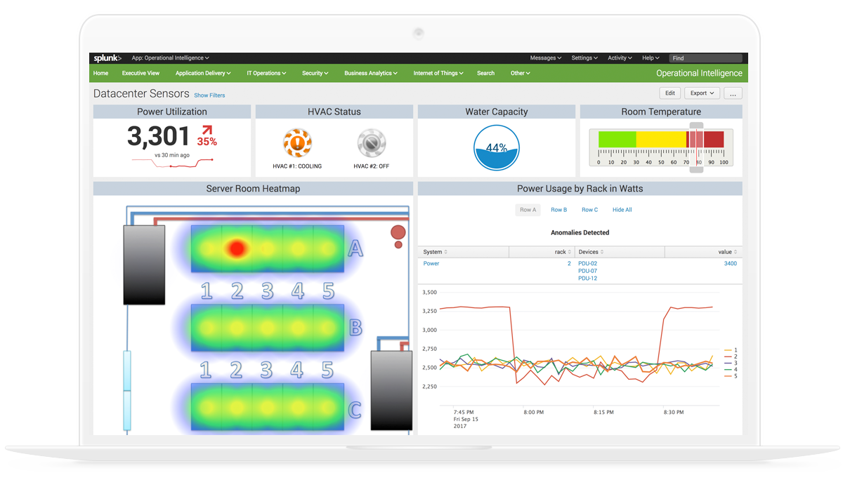
I've included Splunk Enterprise in my top picks because it's one of the few dashboard platforms that genuinely unifies security and observability data in a single view. Using Dashboard Studio, I can build real-time dashboards that pull from both security event logs and infrastructure metrics simultaneously, without switching tools. I also like that it supports pre-built dashboards for threat detection and service health side by side, so my team can correlate a spike in failed logins with a surge in CPU usage on the same screen.
Splunk Enterprise Key Features
- SPL-based data querying: Use Splunk's Search Processing Language to write custom queries for individual dashboard panels with precise, filtered data.
- Trellis layout: Split a single visualization into multiple panels, each scoped to a different field value, within the same dashboard view.
- Dynamic drilldowns: Configure dashboard panels to link to searches, other dashboards, or external URLs when a data point is clicked.
- Role-based dashboard permissions: Control which users or groups can view, edit, or publish specific dashboards across your Splunk environment.
Splunk Enterprise Integrations
Splunk Enterprise offers more than 2,300 marketplace integrations through Splunkbase, including add-ons for AWS, ServiceNow, Jira, Slack, PagerDuty, Microsoft Azure, Google Cloud Platform, and Kubernetes. It also provides SDKs, APIs, and developer tools for building custom integrations.
Pros and Cons
Pros:
- Free machine learning toolkit is included
- Dashboards provide a single source of truth during incidents
- SPL query language handles complex cross-source correlations
Cons:
- On-premise deployments require substantial infrastructure resources
- Creating polished dashboards requires significant time

Klipfolio is a cloud-based dashboard platform designed for small businesses and startups. It allows users to create real-time business dashboards to visualize and track key performance metrics.
Why I picked Klipfolio: Klipfolio offers an intuitive dashboard experience tailored to small businesses. It provides pre-built templates that simplify the creation of dashboards, making it accessible even if your team isn't technically inclined, while the software’s focus on real-time data ensures you're always up-to-date with your business metrics. All in all, its affordability and ease of use make it a practical choice for startups and small teams.
Standout features & integrations:
Features include pre-built templates that help you set up dashboards quickly, real-time data visualization to keep your team informed with the latest metrics, and customization options that let you tailor dashboards to specific business needs.
Integrations include Google Analytics, Salesforce, Facebook Ads, HubSpot, Twitter, Stripe, Shopify, LinkedIn Ads, Xero, and QuickBooks.
Pros and Cons
Pros:
- Affordable for small teams
- Quick setup with templates
- Cloud-based accessibility
Cons:
- Limited advanced features
- Can be slow with big data

Tableau is a data visualization tool used primarily by analysts and business intelligence professionals. It helps users turn raw data into interactive and shareable dashboards that facilitate insightful decision-making.
Why I picked Tableau: Tableau excels at visualizing complex data sets into easy-to-understand formats. Its drag-and-drop interface allows you to create interactive charts and graphs quickly, and its ability to handle large volumes of data without performance issues is noteworthy. The software also offers extensive customization options, making it ideal for detailed data analysis.
Standout features & integrations:
Features include intuitive drag-and-drop functionality, interactive dashboards, sophisticated data visualization capabilities, chart and graph customization, and visual data analysis.
Integrations include Salesforce, Google Analytics, Microsoft Excel, Amazon Redshift, Oracle NetSuite, SAP HANA, Teradata, Snowflake, Google BigQuery, and Splunk.
Pros and Cons
Pros:
- Handles large data sets
- Extensive customization options
- Interactive data visualizations
Cons:
- Requires training for complex tasks
- Steep learning curve for beginners

Cyfe is a business dashboard solution designed for companies looking to consolidate data from multiple sources into a single view. It allows businesses to monitor and analyze performance metrics across different departments.
Why I picked Cyfe: Cyfe offers an advanced platform for monitoring various business metrics in one place. It provides pre-built widgets that make setting up dashboards quick and easy for your team. Plus, the tool's all-in-one approach helps you track marketing, sales, finance, and more without switching platforms. With its focus on holistic business views, Cyfe simplifies the process of data consolidation while improving user experience.
Standout features & integrations:
Features include an array of pre-built widgets that let you start tracking data right away, all-in-one business dashboards to help you keep an eye on metrics across different departments, and a user-friendly interface.
Integrations include Google Analytics, Salesforce, Facebook, Twitter, Mailchimp, QuickBooks, Shopify, Wordpress, Instagram, and LinkedIn.
Pros and Cons
Pros:
- Comprehensive data consolidation
- Easy setup with widgets
- Tracks multiple business metrics
Cons:
- Limited advanced analytics
- Basic visualization options
Mode is an advanced analytics platform tailored for data scientists and analysts who rely heavily on SQL for data exploration. It enables users to query data, create visualizations, and collaborate on data projects.
Why I picked Mode: Mode is designed for teams that need strong SQL integration, making data analysis more efficient. It allows you to run complex queries and visualize the results without switching between tools. The platform's collaboration features also let your team work together on data projects seamlessly. As a result, Mode is ideal for data-driven teams looking to derive insights from raw data.
Standout features & integrations:
Features include a SQL editor that supports complex queries, making data analysis straightforward and efficient. Mode also provides visualization tools that let you turn query results into interactive charts, and deep collaboration features to allow your team to share insights and work on data projects together.
Integrations include Salesforce, Google Analytics, Amazon Redshift, PostgreSQL, MySQL, BigQuery, Snowflake, Oracle NetSuite, SAP HANA, and Microsoft SQL Server.
Pros and Cons
Pros:
- Strong SQL capabilities
- Supports complex data queries
- Facilitates team collaboration
Cons:
- Basic visualization options
- May require technical support

Databox is a business analytics tool designed for marketing and sales teams to track performance metrics. It allows users to access data and insights on-the-go through its mobile-friendly dashboards.
Why I picked Databox: Databox offers a unique mobile experience, allowing your team to monitor KPIs from anywhere. Its pre-built templates make it easy to set up dashboards quickly, while its customizable alerts help you stay updated with real-time data. Additionally, the software’s mobile-first approach ensures you have access to critical metrics at all times, making data analysis simple and efficient.
Standout features & integrations:
Features include mobile-friendly dashboards to keep you connected to your data on-the-go, customizable alerts to ensure you never miss important updates, and pre-built templates to help your team set up and visualize data effortlessly.
Integrations include Google Analytics, HubSpot, Salesforce, Facebook Ads, QuickBooks, Shopify, Stripe, LinkedIn Ads, Instagram Insights, and Mailchimp.
Pros and Cons
Pros:
- Mobile-first design
- Quick setup with templates
- Real-time customizable alerts
Cons:
- Limited desktop functionalities
- Requires consistent internet access
Altri Software per Dashboard
Ecco alcune altre opzioni di software per dashboard che non sono rientrate nella mia shortlist, ma che vale comunque la pena valutare:
- Sisense
For embedded analytics
- Athenic
For AI-powered dashboards
- Microsoft Power BI
For integrating with Microsoft tools
- Grafana Cloud
For open-source monitoring
- Qlik Sense
For interactive dashboards
- FineBI 6.1
For self-service BI
- Geckoboard
For real-time KPI tracking
- Domo
For large enterprises
- Adverity
For marketing data integration
- Supermetrics
For data extraction
- Zoho Analytics
For cross-functional teams
- Insight Software
For embedded analytics solutions


Criteri di Selezione del Software per Dashboard
Nella selezione dei migliori software per dashboard inclusi in questa lista, ho preso in considerazione le esigenze comuni degli acquirenti e i principali punti critici come le capacità di integrazione dei dati e le interfacce user-friendly. Ho inoltre utilizzato il seguente schema per mantenere la valutazione strutturata ed equa:
Funzionalità di Base (25% del punteggio totale)
Per essere considerato in questa lista, ogni soluzione doveva rispondere a questi casi d’uso comuni:
- Visualizzazione dei dati
- Aggiornamenti dati in tempo reale
- Progettazione personalizzata delle dashboard
- Integrazione di dati da più fonti
- Reportistica e analisi
Caratteristiche Distintive Extra (25% del punteggio totale)
Per restringere ulteriormente la selezione, ho anche cercato funzionalità uniche come:
- Analisi predittiva
- Capacità di analytics integrati
- Sicurezza avanzata dei dati
- Analisi guidata da intelligenza artificiale
- Accesso tramite app mobile
- Ulteriori modelli di dashboard
- Autenticazione e permessi utente
Usabilità (10% del punteggio totale)
Per valutare l’usabilità di ogni sistema, ho preso in considerazione i seguenti aspetti:
- Interfaccia intuitiva
- Facilità di navigazione
- Curva di apprendimento minima
- Design accattivante
- Opzioni di personalizzazione
Onboarding (10% del punteggio totale)
Per valutare l’esperienza di onboarding di ogni piattaforma, ho considerato i seguenti aspetti:
- Disponibilità di video formativi
- Tour interattivi del prodotto
- Accesso a modelli preimpostati
- Webinar e workshop
- Guide introduttive di supporto
Assistenza Clienti (10% del punteggio totale)
Per valutare i servizi di assistenza clienti di ciascun fornitore software, ho considerato i seguenti aspetti:
- Disponibilità del supporto 24/7
- Tempo di risposta
- Qualità dell'assistenza
- Accesso alla documentazione di aiuto
- Disponibilità della chat dal vivo
Rapporto Qualità/Prezzo (10% del punteggio totale)
Per valutare il rapporto qualità/prezzo di ciascuna piattaforma, ho considerato i seguenti punti:
- Prezzi competitivi
- Funzionalità offerte in relazione al prezzo
- Scalabilità dei piani tariffari
- Costi o commissioni nascosti
- Soddisfazione dei clienti riguardo ai costi
Recensioni dei Clienti (10% del punteggio totale)
Per comprendere il livello generale di soddisfazione dei clienti, ho tenuto conto dei seguenti elementi nelle recensioni degli utenti:
- Valutazioni di soddisfazione generale
- Pro e contro frequentemente menzionati
- Feedback sull'utilità delle funzionalità
- Descrizioni dell'esperienza utente
- Feedback su supporto e servizio
Come Scegliere un Software per Dashboard
È facile perdersi tra lunghe liste di funzionalità e strutture di prezzo complesse. Per aiutarti a rimanere concentrato durante il tuo processo di selezione software, ecco una checklist di fattori da tenere a mente:
| Fattore | Cosa Considerare |
| Scalabilità | Questo software crescerà insieme al tuo team? |
| Integrazioni | Si connette con i tuoi strumenti esistenti? |
| Personalizzazione | Puoi adattarlo alle tue esigenze specifiche? |
| Facilità d'Uso | È semplice per il tuo team da apprendere e utilizzare? |
| Budget | Rientra nei tuoi limiti di spesa? |
| Salvaguardie di Sicurezza | Soddisfa i tuoi requisiti di sicurezza e conformità? |
| Supporto | È disponibile un supporto clienti adeguato? |
| Accesso Mobile | È facilmente accessibile da dispositivi mobili? |
Tendenze Nei Software per Dashboard
Nella mia ricerca, ho consultato innumerevoli aggiornamenti di prodotto, comunicati stampa e log delle novità provenienti da diversi fornitori di software per dashboard. Ecco alcune delle tendenze emergenti che sto monitorando:
- Insight Guidati dall’AI: Sempre più strumenti utilizzano l’intelligenza artificiale per offrire approfondimenti sui dati. Questo aiuta gli utenti a prendere decisioni informate più rapidamente, analizzando schemi e prevedendo tendenze future.
- Visualizzazioni Personalizzabili: Gli utenti cercano più personalizzazione nei loro dashboard. Gli strumenti ora offrono opzioni avanzate di personalizzazione, consentendo alle aziende di adattare le visualizzazioni alle proprie esigenze specifiche. Questa tendenza facilita ai team il concentrarsi sulle metriche per loro più rilevanti.
- Analisi Incorporata: Le aziende desiderano analisi integrate nei loro strumenti e flussi di lavoro esistenti. Molti fornitori ora offrono soluzioni di analytics embedded, permettendo agli utenti di accedere agli insight senza cambiare piattaforma.
- Attenzione alla Privacy dei Dati: Con il rafforzarsi delle normative sui dati, i software per dashboard stanno potenziando le proprie funzionalità di tutela della privacy. Garantire la conformità a regolamenti come il GDPR sta diventando prioritario e le aziende stanno implementando controlli per la privacy più avanzati. Questa tendenza risponde ai crescenti timori legati alla sicurezza dei dati.
- Analytics Aumentata: Questa tendenza prevede l’utilizzo del machine learning per automatizzare la preparazione dei dati e la generazione di insight. Semplifica l’analisi complessa, rendendola accessibile anche agli utenti non tecnici.
Cos’è un Software per Dashboard?
I software per dashboard permettono a CRO e professionisti RevOps di aggregare dati da fonti diverse in un’unica vista interattiva. Consolidando i principali indicatori di ricavo e le metriche di performance, queste piattaforme consentono ai leader di monitorare la salute del pipeline, tracciare i progressi verso gli obiettivi e prendere decisioni informate basate sui dati. Con funzionalità quali visualizzazioni personalizzabili, insight alimentati dall’intelligenza artificiale e integrazione fluida delle analytics, i software per dashboard semplificano la reportistica e aiutano i team a individuare rapidamente opportunità e affrontare le criticità nell’ambito delle operazioni di ricavo.
Caratteristiche del Software per Dashboard
Quando selezioni un software per dashboard, assicurati di considerare le seguenti funzionalità chiave:
- Visualizzazione dei dati: Trasforma i dati grezzi in formati visivi come grafici e diagrammi, facilitando la comprensione degli insight a colpo d'occhio.
- Aggiornamenti dati in tempo reale: Fornisce informazioni aggiornate al minuto, consentendo agli utenti di prendere decisioni tempestive e informate.
- Dashboard personalizzabili: Permette agli utenti di adattare i propri dashboard per concentrarsi sulle metriche più rilevanti per le proprie esigenze.
- Integrazione dati da più fonti: Combina dati provenienti da diverse piattaforme, offrendo una visione completa delle prestazioni aziendali in un unico luogo.
- Insight guidati dall’IA: Utilizza l’intelligenza artificiale per analizzare i modelli dei dati e prevedere tendenze future, migliorando il processo decisionale.
- Analisi integrate: Integra le analisi direttamente negli strumenti già in uso, permettendo agli utenti di accedere agli insight all’interno del loro flusso di lavoro.
- Dashboard interattivi: Offre interattività che consente agli utenti di esplorare i dati in profondità, scoprendo dettagli tramite visualizzazioni dinamiche.
- Controlli sulla privacy dei dati: Garantisce la conformità alle normative sui dati e protegge le informazioni sensibili, affrontando eventuali preoccupazioni sulla sicurezza.
- Funzionalità di collaborazione: Permette ai team di condividere gli insight e lavorare insieme su progetti basati sui dati, favorendo un ambiente collaborativo.
- Analisi aumentata: Automatizza la preparazione dei dati e la generazione di insight, rendendo le analisi complesse accessibili anche agli utenti non tecnici.
Vantaggi del software per dashboard
L’implementazione di un software per dashboard offre numerosi vantaggi per il tuo team e la tua azienda. Eccone alcuni a cui puoi guardare con interesse:
- Miglioramento del processo decisionale: Gli aggiornamenti in tempo reale e gli insight guidati dall’IA aiutano il team a prendere decisioni informate in modo rapido.
- Maggiore comprensione dei dati: La visualizzazione dei dati trasforma set di dati complessi in elementi visivi facili da interpretare, rendendo gli insight più chiari.
- Efficienza aumentata: I dashboard personalizzabili consentono agli utenti di concentrarsi sulle metriche chiave, riducendo il tempo necessario per trovare le informazioni.
- Migliore collaborazione: Le funzionalità di collaborazione permettono ai team di condividere facilmente gli insight e lavorare insieme su progetti basati sui dati.
- Maggiore accessibilità ai dati: L'integrazione di dati da più fonti riunisce tutte le informazioni in un unico luogo, offrendo una visione completa della tua azienda.
- Conformità e sicurezza: I controlli sulla privacy dei dati assicurano che le informazioni siano conformi ai requisiti normativi e rimangano protette.
- Accessibilità per utenti non tecnici: L’analisi aumentata rende accessibile l’analisi dei dati complessi, permettendo a più membri del team di interagire con i dati.
Costi e prezzi del software per dashboard
Per selezionare il software per dashboard più adatto, è fondamentale comprendere i diversi modelli e piani tariffari disponibili. I costi variano a seconda delle funzionalità, della dimensione del team, degli extra e altro ancora. La tabella seguente riassume i piani più comuni, i loro prezzi medi e le funzionalità generalmente incluse nelle soluzioni di software per dashboard:
Tabella comparativa dei piani per software di dashboard
| Tipo di piano | Prezzo medio | Funzionalità comuni |
| Piano gratuito | $0 | Visualizzazione dati di base, dashboard limitati e supporto della community. |
| Piano personale | $5-$25/user/month | Dashboard personalizzabili, integrazione dati da più fonti e supporto email. |
| Piano business | $30-$70/user/month | Aggiornamenti dati in tempo reale, strumenti di collaborazione e funzionalità di sicurezza avanzate. |
| Piano enterprise | $75-$150/user/month | Analisi avanzate, supporto dedicato e ampie opzioni di personalizzazione. |
Domande Frequenti sul Software Dashboard
Ecco alcune risposte alle domande più comuni sul software dashboard:
Quali sono alcuni degli svantaggi nell'utilizzare le dashboard?
Le dashboard a volte possono non rilevare anomalie in tempo reale, il che può impedire una gestione proattiva degli incidenti. Potrebbero inoltre fare troppo affidamento sui dati storici, rischiando di non individuare piccoli incidenti che potrebbero avere effetti negativi sulla tua azienda. Un’eccessiva dipendenza può portare a dashboard sovraccariche di falsi positivi e a una mancanza di una vera priorità intelligente.
Perché la maggior parte delle dashboard fallisce?
Molte dashboard falliscono perché includono metriche non allineate che riempiono l’interfaccia di dati non correlati. Questo può distrarre gli utenti da intuizioni chiave e portare a una paralisi decisionale. Quando si è sommersi dalle informazioni, i decisori possono faticare a trarre conclusioni utili.
Come possono le dashboard migliorare la performance aziendale?
Le dashboard migliorano la performance aziendale offrendo una panoramica chiara delle metriche chiave in tempo reale. Aiutano il tuo team a prendere decisioni informate in modo rapido ed efficiente. Consolidando i dati da più fonti, le dashboard garantiscono che tutti abbiano accesso alle stesse informazioni aggiornate.
Le dashboard possono essere personalizzate in base alle diverse esigenze aziendali?
Sì, la maggior parte dei software dashboard consente la personalizzazione per soddisfare molteplici esigenze aziendali. Puoi personalizzare il layout, scegliere quali metriche mostrare e impostare avvisi per dati specifici. Questa flessibilità assicura che tu riceva le informazioni più rilevanti per la tua azienda.
Come migliorano la collaborazione di squadra le dashboard?
Le dashboard migliorano la collaborazione di squadra fornendo una piattaforma centralizzata dove tutti possono accedere agli stessi dati. Permettono la condivisione in tempo reale di intuizioni e risultati, facilitando la discussione e l’allineamento sulle strategie. Con dashboard condivise, i membri del team possono contribuire in modo più efficace a progetti basati sui dati.
Cosa succede dopo:
Se sei nella fase di ricerca di un software per dashboard, contatta gratuitamente un consulente SoftwareSelect per ricevere consigli personalizzati.
Compila un modulo e partecipa a una breve chiamata in cui andranno ad approfondire le tue esigenze specifiche. Poi riceverai una lista ristretta di software da valutare. Ti supporteranno anche durante l'intero processo di acquisto, incluse le trattative sul prezzo.