I 10 Migliori Software di Visualizzazione dei Dati nel 2026

10 Migliori software di data visualization - Scelta rapida


Orientarsi tra le complessità delle operazioni di ricavo non è semplice. Devi gestire montagne di dati che devono essere compresi rapidamente e con precisione. È qui che entra in gioco un software di data visualization. Trasforma numeri grezzi in rappresentazioni visive chiare, rendendo più facile per te e il tuo team prendere decisioni informate.
Ho testato e recensito numerose soluzioni software per aiutarti a trovare quella più adatta. In questo articolo, condividerò le mie scelte migliori, imparziali e frutto di una ricerca approfondita. Troverai informazioni su funzionalità, vantaggi e svantaggi, aiutandoti a scegliere lo strumento giusto per le tue esigenze.
Resta con me mentre esploriamo opzioni che possono far sì che i tuoi dati lavorino per te, non contro di te.
Table of Contents
Why Trust Our Software Reviews
We’ve been testing and reviewing RevOps software since 2022. As RevOps leaders ourselves, we know how critical and difficult it is to make the right decision when selecting software.
We invest in deep research to help our audience make better software purchasing decisions. We’ve tested more than 2,000 tools for different RevOps use cases and written over 1,000 comprehensive software reviews. Learn how we stay transparent & our software review methodology.
Riepilogo dei migliori software di data visualization
Questa tabella comparativa riassume i dettagli sui prezzi delle mie principali scelte di software di data visualization per aiutarti a trovare quello più adatto al tuo budget e alle esigenze della tua azienda.
| Tool | Best For | Trial Info | Price | ||
|---|---|---|---|---|---|
| 1 | Best for real-time, cross-channel journey mapping | Free trial + free demo available | Pricing upon request | Website | |
| 2 | Best for non-coders | Free plan available | From $49/month (billed annually) | Website | |
| 3 | Best for secure data collaboration | Free $400 credits + free plan + free demo available | Pricing upon request | Website | |
| 4 | Best scalable data visualization tool. | 60-day free trial | Pricing upon request | Website | |
| 5 | Best for Zoho customers. | 15-day free trial + free plan + free demo available | From $24/month (billed annually) | Website | |
| 6 | Best for converting data into interactive reports | Free plan available | From $29/month | Website | |
| 7 | Best for conversational dashboards | Free plan available | From $16/month (billed annually) | Website | |
| 8 | Best for AI-driven marketing insights | 14-day free trial + free demo available | From $44/month (billed annually) | Website | |
| 9 | Best for cross-database work | 21-day free trial | From $199/user/year (billed annually) | Website | |
| 10 | Best for data connections. | 14-day free trial | From $120/month (billed annually) | Website |
-

Prisync
Visit WebsiteThis is an aggregated rating for this tool including ratings from Crozdesk users and ratings from other sites.4.7 -
Expedite Commerce
Visit Website -
QuickBooks Online
Visit WebsiteThis is an aggregated rating for this tool including ratings from Crozdesk users and ratings from other sites.4


Recensioni sui migliori software di data visualization
Di seguito trovi i miei riepiloghi dettagliati dei migliori software di data visualization che sono entrati nella mia shortlist. Le mie recensioni offrono uno sguardo approfondito alle principali funzionalità, vantaggi e svantaggi, integrazioni e casi d’uso ideali di ciascuno strumento per aiutarti a trovare quello più adatto a te.
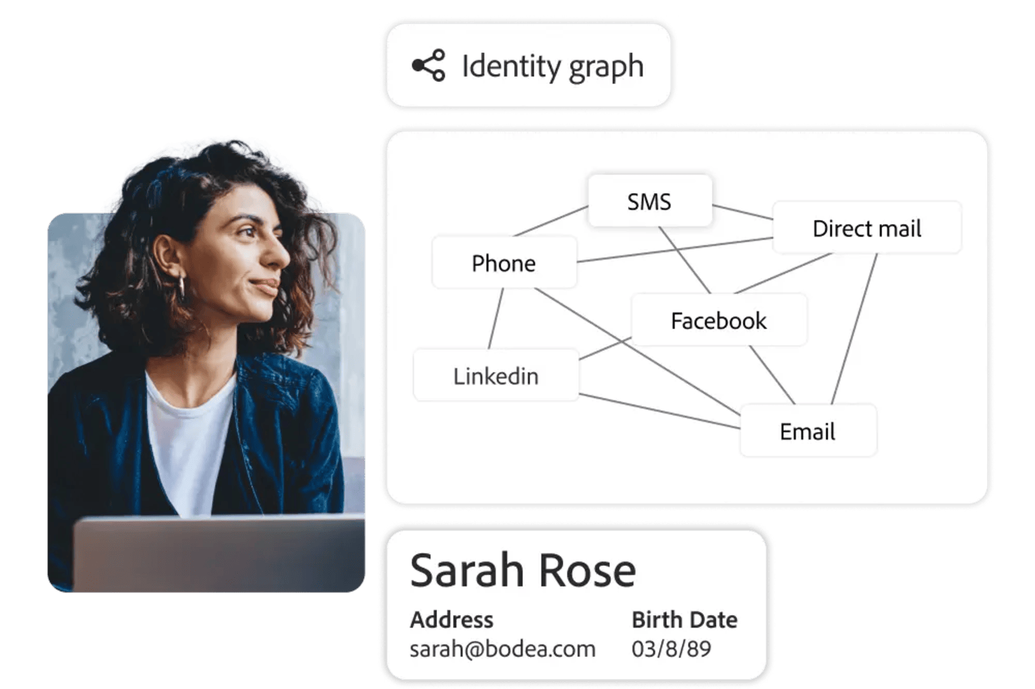
Adobe Customer Journey Analytics is an advanced data visualization platform for analyzing and mapping customer journeys across multiple channels using interactive dashboards and unified data sources.
Who Is Adobe Customer Journey Analytics Best For?
Enterprise analytics teams and digital marketing departments in large organizations that need to visualize and analyze complex, multi-channel customer journeys.
Why I Picked Adobe Customer Journey Analytics
I picked Adobe Customer Journey Analytics as one of the best because I can visualize customer journeys in real time across web, mobile, and offline channels. I use its interactive flow and pathing diagrams to see how users move between touchpoints. My team relies on its live data streaming to spot trends and shifts as they happen.
Adobe Customer Journey Analytics Key Features
- Custom dashboard builder: Create tailored dashboards with drag-and-drop widgets and visualizations.
- Advanced segmentation tools: Segment audiences using filters and rules for deeper analysis.
- Data blending capabilities: Combine data from multiple sources for unified reporting.
- Scheduled report exports: Automate delivery of visual reports to stakeholders on a set schedule.
Adobe Customer Journey Analytics Integrations
Adobe Customer Journey Analytics offers native integrations with Adobe Experience Platform, Adobe Analytics, Adobe Audience Manager, Adobe Target, and Adobe Campaign. It also provides an API for custom integrations and supports connections to external data sources through Adobe Experience Platform connectors.
Pros and Cons
Pros:
- Drill down into multi-dimensional data visualizations
- Native integration with Adobe Experience Platform
- Granular privacy controls for sensitive data fields
Cons:
- Custom metric creation can require technical expertise
- Limited native integrations outside Adobe ecosystem
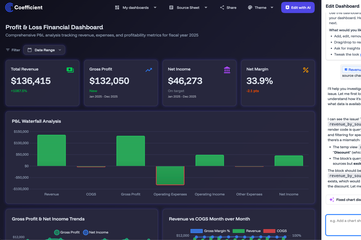
For those seeking a data visualization solution that integrates with existing tools, Coefficient offers a platform that connects Google Sheets and Excel with over 100 data sources like Salesforce and QuickBooks. It's particularly appealing to professionals in revenue operations, marketing, finance, and business intelligence, who desire to automate data processes and make informed decisions without the complexity of coding. Coefficient addresses the challenge of manual data collection and management, enabling teams to focus more on strategic insights.
Why I Picked Coefficient
I chose Coefficient because it serves as a powerful bridge for users who are spreadsheet-savvy but don't know how to code API integrations. Because it can transform spreadsheets into data visualization tools with its point-and-click interface, it's the best for non-coders who want to build automated dashboards. In addition, the platform's AI-driven dashboard builder allows you to create interactive dashboards without coding, which is ideal for teams needing quick insights. These features directly address the need for data analysis and visualization, allowing your team to make data-driven decisions with ease.
Coefficient Key Features
In addition to its intuitive dashboard builder, I also found several other features that enhance its data visualization capabilities:
- GPT Assistance: Use natural language prompts to automatically generate spreadsheet formulas, pivot tables, and data summaries.
- SQL Query Builder: This feature allows you to perform advanced data queries directly within your spreadsheets, expanding your data manipulation capabilities.
- Automated Alerts: Receive real-time updates via Slack or email, ensuring your team is always informed of critical data changes.
- Browser Agents for Data Scraping: Collect and integrate data from web sources directly into your spreadsheets, broadening your data collection scope.
Coefficient Integrations
Integrations include Salesforce, QuickBooks, Snowflake, HubSpot, Google Analytics, MySQL, Redshift, and more. Coefficient also provides an API for custom integrations.
Pros and Cons
Pros:
- Supports two-way data syncs
- Automated real-time data refreshes
- No SQL knowledge required
Cons:
- Limited customization for dashboard aesthetics
- Limited to spreadsheet environments
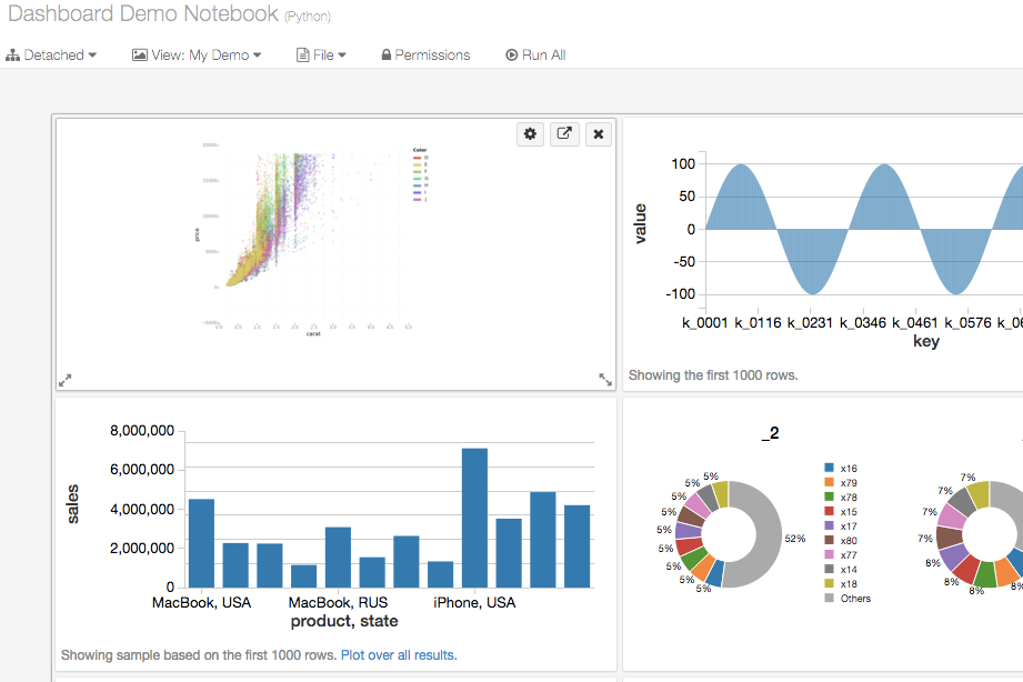
Databricks is a cloud-based data intelligence platform that combines data engineering, machine learning, and SQL analytics—including AI/BI dashboards and conversational data exploration—in one environment.
Who Is Databricks Best For?
Databricks is a strong fit for data engineers, data scientists, and analytics engineers at mid-to-large enterprises managing large-scale, complex data environments.
Why I Picked Databricks
Databricks is one of my top picks because I love how it handles secure data collaboration at a level most visualization tools simply can't match. Unity Catalog sits at the center of this: you can define fine-grained access controls at the row and column level, auto-classify sensitive data like PII, and enforce policies so every dashboard or query only surfaces what a user is permitted to see. On top of that, Databricks Clean Rooms let teams run joint analysis on sensitive data across organizational boundaries without either party ever exposing raw records to the other.
Databricks Key Features
- AI/BI dashboards: Build interactive, shareable dashboards with dynamic filters, drill-through navigation, and AI-assisted chart creation directly in the platform.
- Genie conversational analytics: Query data using plain-language questions to instantly generate charts and tables without writing SQL.
- Notebook visualizations: Create inline charts across multiple chart types, including scatter plots, heatmaps, and choropleth maps, within live data notebooks.
- AI-powered forecasting: Apply predictive forecasting to existing dashboard charts to visualize projected trends alongside historical data.
Databricks Integrations
Databricks offers validated integrations with a wide range of third-party tools through Partner Connect, covering data ingestion, BI, machine learning, and data governance. BI and visualization partners include Power BI, Tableau, Qlik Sense, Sigma Computing, ThoughtSpot, Hex, and Preset, along with data ingestion tools like Fivetran and Informatica, and transformation tools like dbt Cloud and Prophecy. Databricks is available on Zapier, and it provides a REST API for custom integrations.
Pros and Cons
Pros:
- Supports choropleth maps, Sankey, and cohort charts
- AI-assisted chart creation from natural language
- Queries and visualizes data in one platform
Cons:
- Built-in chart options trail dedicated BI tools
- Code-first approach limits non-technical users

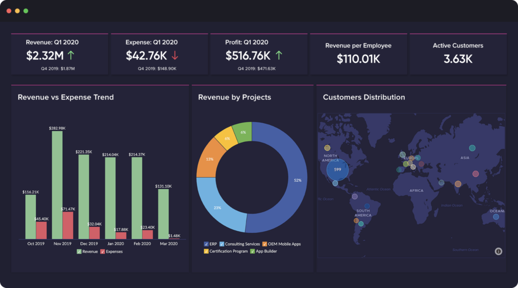
Splunk Enterprise enables users to visualize and act on outcomes faster with artificial intelligence and machine learning.
Why I picked Splunk Enterprise: You can use the platform’s built-in machine learning and AI analytics or create custom models to manage and visualize data. It simplifies collecting, visualizing, analyzing, and acting on your data. Your predictive models can also help you uncover revenue anomalies and display the information for everyone to understand.
Splunk Enterprise fits larger organizations looking to create compelling and actionable data stories. Its tools will help you and your teams make sense of your complex data and empower everyone to identify revenue issues and opportunities. Splunk Enterprise users can build and personalize data visualization dashboards to show the most relevant details for different scenarios and audiences.
Splunk Enterprise Standout Features and Integrations
Features include mobile alerts, augmented reality, TV displays, mobile device fleet management, customized dashboards, data monitoring, real-time reporting, and a machine learning toolkit.
Integrations include Device42, Netreo, Clockspring, strongDM, ControlMap, Silent Push, ShadowKat, Codium, ScanFactory, GitGuardian, Tableau, Okta, and OneLogin.
Pros and Cons
Pros:
- Stores large amounts of data.
- Custom dashboards.
- Easy data retrieval.
Cons:
- Challenging to implement.
- Steep learning curve.
Zoho Analytics can integrate with other Zoho applications to help users collaborate and share data visualizations.
Why I picked Zoho Analytics: Organizations already using Zoho’s other applications will love the ability to unify various business analytics throughout their departments. Like other Zoho applications, Zoho Analytics has ready-made connectors for popular business systems, cloud drives, and databases. If you are familiar with Zoho, you might remember the AI assistant Zia, which the vendor created using AI, machine learning, and natural language processing. Zia helps users answer questions regarding data visualizations.
Zoho Analytics works for any sized business looking to create excellent data visualization from multiple sources and combine them together. The platform allows you to share and publish reports with team members and engage in conversations. Also, Zoho Analytics’ smart data alerts will notify you when it discovers any outliers and anomalies.
Zoho Analytics Standout Features and Integrations
Features include data analytics, performance metrics, predictive analytics, ad-hoc reports, data visualizations, profitability analysis, public and private dashboards, and high-volume data processing.
Integrations include Pipedrive, Stripe, Mortar, Zendesk, Salesforce, Mailchimp, Google Analytics, Slack, HubSpot CRM, Zoho CRM, Dropbox, Microsoft OneDrive, and Quickbooks.
Pros and Cons
Pros:
- Creates in-depth data analysis reports.
- Useful help guides and tutorials.
- Easy to learn.
Cons:
- Mobile app is unintuitive.
- Customer support needs improvement.

Signara is an agentic analytics platform for marketing teams that automates KPI calculations, driver analysis, and dashboard and report generation from connected data sources.
Who Is Signara Best For?
Signara is a good fit for marketing analysts and RevOps teams who need automated reporting across multiple data sources without building reports manually.
Why I Picked Signara
I've included Signara in my top picks because it takes raw marketing data and turns it into a shareable, interactive dashboard in a single automated pass. I particularly like the driver analysis layer, which goes beyond charting KPI values to surface what actually moved a number and by how much. Combined with the AI narrative that generates an auditable, grounded explanation alongside each output, my team gets a complete picture without manually writing commentary or cross-referencing multiple reports.
Signara Key Features
- Deterministic KPI engine: Every metric is computed using auditable, code-based formulas so every number in a report traces back to a verifiable source.
- Plain-English data querying: Type a question like "best channel by spend" and Signara returns a KPI-backed answer pulled directly from the data engine.
- PPTX export: Reports and dashboards can be exported as presentation-ready PowerPoint files in one click, without additional formatting work.
- Multi-source data connectivity: Connect live data from warehouses like Snowflake, BigQuery, and Databricks, or upload Excel, CSV, and Google Sheets files directly.
Signara Integrations
Signara connects to Snowflake, Databricks, BigQuery, PostgreSQL, MySQL, HubSpot, and Google Sheets, and also accepts Excel, CSV, TSV, and JSON file uploads.
Pros and Cons
Pros:
- Full audit trail for every calculation
- Reports created from plain-English queries
- AI-generated recommendations with every report
Cons:
- No API available for custom workflows
- Setup requires high data cleanliness
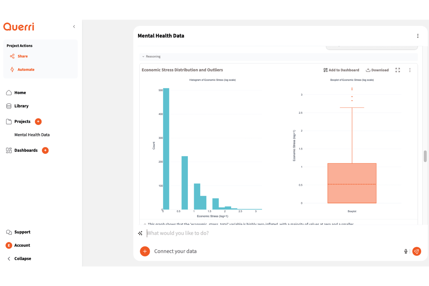
Querri is a data visualization platform that helps marketing teams turn scattered campaign, CRM, and revenue data into dashboards and reports. Its AI-powered analysis and plain-language querying make it useful for marketers who need faster insights without relying heavily on SQL or manual reporting.
Who Is Querri Best For?
Querri is a strong choice for marketing and RevOps teams that need to turn scattered campaign, CRM, and revenue data into interactive dashboards and visual reports.
Why I Picked Querri
I picked Querri because it helps your team turn scattered marketing, CRM, and revenue data into conversational dashboards. You can ask plain-language questions about your data and get visual answers through charts, tables, and dashboards instead of building every report manually. I like that it supports data connectors, file uploads, and automated reports, which helps teams work with data from multiple sources. Its dashboard and export options also make it useful for sharing campaign performance, pipeline trends, and revenue insights with stakeholders.
Querri Key Features
Some other features in Querri support data visualization, reporting, and insight sharing:
- Custom visual reports: Build charts, tables, and reports that help teams compare trends, performance, and key metrics.
- Dashboard sharing: Share dashboards through links, embeds, or exported files for easier stakeholder reporting.
- Role-based permissions: Control who can view or manage dashboards to protect sensitive business data.
- Forecasting tools: Analyze historical trends and pipeline data to support revenue and performance planning.
Querri Integrations
Integrations include HubSpot, Salesforce, QuickBooks, Google Sheets, PostgreSQL, MySQL, SQL Server, BigQuery, Redshift, and Google Drive.
Pros and Cons
Pros:
- Exports reports to PowerPoint, PDF, and Google Sheets
- Joins CRM, billing, and marketing data sources
- Builds dashboards from plain-language data questions
Cons:
- Some marketing and billing tools require file uploads
- Salesforce connector is still in early access
DashThis is an automated marketing reporting tool that helps agencies, businesses, and nonprofits turn complex marketing data into clear, visual dashboards. With customizable templates and white-label options, it makes it easier to present performance results in a way that clients and teams can understand.
Why I picked DashThis: I included DashThis because of its AI Insights feature, currently in beta, which can provide actionable takeaways from raw marketing data. This makes it easier to identify what strategies are working and where adjustments may be needed. I also liked that DashThis doesn’t restrict the number of users or data sources, which is particularly useful if you’re managing multiple accounts or campaigns. The platform’s branded report options also make it a strong choice for agencies that need professional, client-ready dashboards.
DashThis Standout Features and Integrations
Features include customizable dashboards, automated reporting with preset templates, shareable reports via email or PDF, and white-label branding options.
Integrations include Google Ads, Google Analytics 4, Facebook Insights, Instagram Insights, LinkedIn Ads, Mailchimp, YouTube, Bing Ads, Pinterest Ads, SEMrush, TikTok Ads, and HubSpot.
Pros and Cons
Pros:
- Wide range of integrations available
- Simplifies marketing analytics and reporting
- Affordable for small businesses and agencies
Cons:
- Limited customization for report design
- Aesthetic options may not meet all needs
New Product Updates from DashThis

DashThis Adds Calculated Widgets for Cross-Platform Metrics
DashThis introduces Calculated Widgets for building custom cross-platform metrics. The new feature lets users combine metrics from multiple integrations, customize formatting, and display trends without manual calculations. For more information, visit DashThis's official site.
 .
.
DbVisualizer gives you a unified way to explore, query, and manage virtually any database you use — whether you’re an analyst diving into reports, a developer juggling multiple data sources, or a DBA keeping everything running smoothly. With support for dozens of relational and NoSQL systems and a consistent interface across Windows, macOS, and Linux, it lets you treat all your data sources the same way.
Why I Picked DbVisualizer
I picked DbVisualizer because it offers universal database connectivity combined with flexible data browsing — meaning you can connect to nearly any database using JDBC and immediately start exploring schemas, tables, and data without needing a different tool per database type. Its ability to handle multiple simultaneous connections and treat disparate DBMSs through one UI is particularly valuable when your team uses a mix of relational and NoSQL databases. I like that you don’t have to fight with drivers or learn lots of vendor-specific tools. For teams that want a single, consistent database client regardless of backend, DbVisualizer fits neatly.
DbVisualizer Key Features
In addition to its core cross-database connectivity and management capabilities, DbVisualizer offers the following helpful features:
- Table Management: The Pro edition allows creating and altering tables, defining constraints, and exporting data in multiple formats, providing flexibility in data handling.
- Version Control for SQL Scripts: with built-in support for versioning scripts (branching, history, changes), you and your team can track modifications over time — handy when multiple people edit queries or database objects.
- Monitoring and Comparison: The Pro version enables users to monitor SQL results and compare editor buffers, facilitating performance tracking and data integrity checks.
- Security and Customization: The software includes strong password protection and customizable key bindings in the Pro version, ensuring data security and user preference adaptability.
DbVisualizer Integrations
DbVisualizer natively integrates with various databases such as Oracle, SQL Server, MySQL, PostgreSQL, SQLite, and more, allowing seamless connectivity and data management across different platforms.
Pros and Cons
Pros:
- Includes visualization options (charts, graphs) for query results.
- Allows inline editing of data like a spreadsheet for quick changes.
- Works with a very wide range of databases via JDBC support.
Cons:
- No built-in workflow for data standardization, de-duplication, or master-record consolidation.
- Larger datasets can occasionally affect performance.
New Product Updates from DbVisualizer

DbVisualizer Adds AI Assistant and New Database Support
DbVisualizer introduces an AI assistant, OS-native file chooser support, and new database compatibility with Impala and Neo4j. These updates help users write SQL faster, simplify file handling, and expand database connectivity. For more information, visit DbVisualizer’s official site.
 .
.
Klipfolio can access and combine data from hundreds of connections without writing unnecessary code.
Why I picked Klipfolio: It can retrieve and combine your data from multiple sources and create data models by using its pre-built instant metrics. These sources include spreadsheets, files, databases, and web service application connections. Klipfolio allows you to import, edit, and analyze data to get exact, comprehensive insights. You can display your data using one of the platform’s pre-built visualizations from its Klip Gallery.
Klipfolio is a good fit for any business looking to visualize complex data formulas to resolve revenue challenges. The PowerMetrics tool doesn’t require coding expertise or technical help from a development team. You and your teams can share visualizations and reports through view-only links, scheduled emails, Slack messages, or PDFs.
Klipfolio Standout Features and Integrations
Features include performance metrics, visual analytics, data analysis, ad-hoc reports, public and private dashboards, data discovery, dashboard creation, and filtered views.
Integrations include Jira, Freshdesk, BambooHR, SendGrid, Twilio, Pipedrive, Recurly, New Relic, FreshBooks, Stripe, Basecamp, Zendesk, Salesforce, and Google Analytics.
Pros and Cons
Pros:
- Dashboards fit any device.
- Extensive knowledge base.
- Excellent customer support.
Cons:
- Formula editing is complex.
- Steep learning curve.
Altri software di data visualization
Qui trovi alcune ulteriori opzioni di software di data visualization che non sono entrate nella mia shortlist, ma che vale comunque la pena considerare:
- Infogram
For creating infographics.
- Tableau
Intuitive data analysis.
- Qlik
For beginners.
- Adverity
For seamless data integration
- Looker
For creating accessible data platforms.
- Domo
Customizable data dashboards.
- Sisense
Self-service data visualizations.
- SAP Crystal Server
For sharing personalized dashboards.
- Strategy
For drag-and-drop visualizations.
- Athenic
For AI-powered, conversational data insights


How I Evaluate Data Visualization Software
From building executive pipeline dashboards in Tableau to wiring Looker into a Snowflake-backed data warehouse for a SaaS RevOps team, I've seen how much the right tool shapes whether stakeholders actually trust and use the data in front of them. When I put this list together, I think in two layers: what every tool has to do well enough just to make the cut, and what genuinely separates one pick from another for specific teams and use cases.
Core Functionality (Table Stakes for This List)
For data visualization software, the core functionality I test and evaluate is:
- Visualization library: I look at the range of chart and graph types available, from standard bar and line charts to heat maps, treemaps, scatter plots, and geographic maps. If I can't build a cohort retention chart or a pipeline waterfall without workarounds, the library is too shallow.
- Interactive dashboards: Every tool needs to support dashboards with cross-filtering, drill-down, and dynamic parameter controls. I test whether clicking a region on a sales map actually filters the rest of the dashboard in real time, because static views don't cut it for RevOps reporting.
- Data connectivity: I check the connector library for direct connections to databases like PostgreSQL and Snowflake, cloud apps like Salesforce, flat files, and live API endpoints. A tool also needs to blend data from multiple sources into a single view, like joining CRM pipeline data with marketing attribution data.
- Data preparation: I evaluate built-in capabilities for filtering, creating calculated fields, handling joins, and managing aggregations. If I need to leave the platform to do a basic revenue-by-segment calculation, that's a gap.
- Sharing and access control: Dashboards need to be publishable to stakeholders with role-based permissions, scheduled email delivery, and export options like PDF or PowerPoint. I pay close attention to whether viewer-level users can be managed separately from creators, since that directly impacts licensing costs.
- Performance at scale: I push each tool with datasets in the millions of rows to see how it handles query response times, caching, and whether it supports query push-down to the source database. A dashboard that takes 30 seconds to load when your VP asks a pipeline question during a forecast call is a nonstarter.
If a tool can't do these things reliably, it didn't make the cut regardless of what else it offers.
Standout Features (What Separates the Picks)
What really sets tools apart are things like natural language query and AI-powered insights, advanced governance and row-level security, direct embedding and white-labeling for SaaS, flexible deployment options, and how seamlessly each tool fits into broader ecosystems like Microsoft or Salesforce. I look for features that solve real sticking points—like a sales leader getting narrative insights in plain English, or a platform embedding dashboards into client portals without extra engineering effort.
What I Weigh Beyond Features
I also evaluate pricing structure, learning curve, and who each tool is really built for. A per-user license at $75/month hits different for a 10-person team than a 200-person organization, so I look at how licensing scales. I test how long it takes a non-technical ops person to build their first useful dashboard. And I consider ecosystem fit—if your stack runs on Microsoft or Google, that alignment matters more than any feature checklist.
Come scegliere un software di data visualization
È facile perdersi tra lunghe liste di funzionalità e strutture di prezzo complicate. Per aiutarti a restare concentrato durante il tuo processo personale di selezione del software, ecco una checklist di fattori da tenere presenti:
| Fattore | Cosa considerare |
|---|---|
| Scalabilità | Il software crescerà con la tua azienda? Controlla se gestisce grandi volumi di dati e supporta più utenti man mano che aumentano le tue esigenze. |
| Integrazioni | Si collega ai tuoi strumenti già in uso? Assicurati che si integri con CRM, database e altre piattaforme essenziali per evitare l'inserimento manuale dei dati. |
| Personalizzazione | Può essere adattato al tuo flusso di lavoro? Cerca la possibilità di personalizzare dashboard, report e permessi utente per adattarli alle esigenze del tuo team. |
| Facilità d’uso | È intuitivo? Scegli un software con un'interfaccia user-friendly per ridurre i tempi di formazione e migliorare l’adozione nel tuo team. |
| Implementazione e onboarding | Quanto è semplice il processo di configurazione? Valuta il tempo e le risorse necessari per l’implementazione, incluso il supporto o la formazione offerti dal fornitore. |
| Costo | Rientra nel tuo budget? Confronta i diversi piani di prezzo, fai attenzione a eventuali costi nascosti e valuta i costi a lungo termine rispetto ai benefici. |
| Sicurezza | Come protegge i tuoi dati? Cerca funzioni come la crittografia, il controllo degli accessi utente e la conformità alle normative sulla protezione dei dati. |
| Disponibilità dell’assistenza | Riceverai supporto quando necessario? Verifica la disponibilità di assistenza 24/7, i tempi di risposta e la presenza di documentazione dettagliata o di community di utenti. |
Tendenze
I software di visualizzazione dei dati stanno diventando sempre più sofisticati, offrendo funzionalità avanzate che rispondono a una gamma più ampia di esigenze aziendali, in particolare nella gestione delle operazioni sul fatturato. Ecco un'analisi delle tendenze attuali basata su aggiornamenti recenti dei prodotti, comunicati stampa e log di rilascio:
Integrazione e interoperabilità:
- Integrazione dati senza soluzione di continuità: Capacità migliorate per integrare fonti di dati eterogenee, fornendo una vista unificata cruciale per un'analisi completa del fatturato.
- Compatibilità multipiattaforma: Attenzione crescente nell'assicurare che gli strumenti di visualizzazione dei dati funzionino senza problemi su diverse piattaforme e dispositivi, consentendo agli utenti di accedere alle informazioni ovunque e in qualsiasi momento.
Funzionalità analitiche avanzate:
- Analisi predittiva: Integrazione dell'analisi predittiva negli strumenti di visualizzazione dei dati, permettendo alle aziende di prevedere tendenze e prendere decisioni proattive.
- Generazione automatica di insight: Utilizzo dell'intelligenza artificiale per identificare e mettere in evidenza automaticamente i principali punti e tendenze dei dati, riducendo il tempo necessario per l'analisi manuale.
Tipologie innovative di visualizzazione:
- Visualizzazioni immersive: Introduzione delle tecnologie VR e AR per creare esperienze di visualizzazione dei dati immersive, offrendo nuove prospettive nell'analisi dei dati.
- Streaming dati in tempo reale: Funzionalità per la visualizzazione di dati in streaming in tempo reale, permettendo risposte immediate a nuove tendenze e problematiche.
Collaborazione e condivisione:
- Funzionalità di collaborazione avanzate: Strumenti che facilitano la collaborazione tra i membri del team, compresi dashboard condivisi e report interattivi, fondamentali per allineare le strategie operative sul fatturato.
- Meccanismi sicuri di condivisione: Miglioramento delle funzionalità di sicurezza per la condivisione delle visualizzazioni dei dati, garantendo che i dati sensibili relativi al fatturato siano protetti pur consentendo decisioni informate a livello di team.
Queste tendenze riflettono la crescente consapevolezza del valore strategico della visualizzazione dei dati nel guidare il successo aziendale, in particolare nel contesto delle operazioni legate ai ricavi. Quando si sceglie uno strumento di visualizzazione dati, le organizzazioni dovrebbero tenere conto di queste tendenze per assicurarsi una soluzione che rimanga rilevante e preziosa di fronte al rapido cambiamento tecnologico.
Cos'è un software di visualizzazione dei dati?
Un software di visualizzazione dei dati è uno strumento che trasforma dati grezzi in formati visivi come grafici, diagrammi e dashboard. Professionisti come analisti, marketer e dirigenti utilizzano questi strumenti per comprendere i dati e prendere decisioni informate. Funzionalità come aggiornamenti dei dati in tempo reale, integrazioni e personalizzabilità facilitano l'analisi di set di dati complessi e la condivisione delle informazioni. In generale, questi strumenti rendono i dati più facili da interpretare e da utilizzare.
Caratteristiche
Quando selezioni un software di visualizzazione dei dati, fai attenzione alle seguenti caratteristiche chiave:
- Aggiornamenti in tempo reale: Permettono agli utenti di visualizzare i dati più attuali, aiutando a prendere decisioni tempestive.
- Dashboard interattivi: Consentono agli utenti di esplorare i dati tramite grafici e tabelle cliccabili per approfondimenti più dettagliati.
- Integrazioni: Si collegano senza difficoltà con altri strumenti come CRM e database per centralizzare i dati.
- Personalizzabilità: Permette agli utenti di adattare le visualizzazioni alle esigenze specifiche e al proprio branding.
- Interfaccia intuitiva: Semplifica la navigazione e riduce il tempo di apprendimento per i nuovi utenti.
- Opzioni di import/export dati: Facilita il trasferimento semplice dei dati all'interno e all'esterno del software per la reportistica.
- Tutele di sicurezza: Protegge i dati sensibili attraverso crittografia e controlli di accesso.
- Accesso mobile: Offre accesso ai dati ovunque ti trovi, garantendo agli utenti la possibilità di consultare le informazioni in movimento.
- Analisi avanzate: Fornisce strumenti per previsioni e analisi approfondite dei dati, a supporto della pianificazione strategica.
Vantaggi
L'implementazione di un software di visualizzazione dei dati offre numerosi vantaggi per il tuo team e la tua azienda. Eccone alcuni a cui puoi guardare con interesse:
- Miglioramento del processo decisionale: Le visualizzazioni aiutano i team a comprendere rapidamente le tendenze dei dati e a prendere decisioni informate.
- Collaborazione potenziata: I dashboard interattivi permettono ai membri del team di condividere facilmente le informazioni e lavorare insieme in modo più efficace.
- Risparmio di tempo: L'aggiornamento automatico dei dati e le integrazioni riducono l'inserimento manuale dei dati e lo sforzo nella creazione di report.
- Migliore comprensione dei dati: Formati visivi come grafici e diagrammi semplificano i dati complessi, rendendoli più facili da interpretare.
- Aumentata accessibilità: L’accesso mobile garantisce agli utenti la possibilità di visualizzare e analizzare i dati ovunque e in qualsiasi momento.
- Supporto alla scalabilità: Con la crescita dell’azienda, il software può gestire set di dati più ampi e più utenti senza difficoltà.
- Sicurezza dei dati: Potenti funzionalità di sicurezza proteggono le informazioni sensibili, mantenendo l'integrità e la conformità dei dati.
Costi e prezzi
La scelta di un software di visualizzazione dati richiede la comprensione dei diversi modelli e piani tariffari disponibili. I costi variano in base alle funzionalità offerte, alla dimensione del team, agli add-on e ad altri fattori. La tabella seguente riassume i piani più comuni, i prezzi medi e le funzionalità tipiche incluse nelle soluzioni di software di visualizzazione dati:
Tabella comparativa dei piani per software di visualizzazione dati
| Tipo di piano | Prezzo medio | Funzionalità comuni |
|---|---|---|
| Piano gratuito | $0 | Grafici di base, fonti dati limitate e supporto dalla community. |
| Piano personale | $10-$30/user/month | Dashboard personalizzabili, integrazione con più fonti dati e supporto via email. |
| Piano business | $50-$100/user/month | Analisi avanzata, supporto prioritario, strumenti di collaborazione e accesso mobile. |
| Piano enterprise | $100+/user/month | Personalizzazione totale, aggiornamento dati in tempo reale, account manager dedicato e funzioni di sicurezza avanzate. |
FAQ sul Software di Visualizzazione Dati
Ecco alcune risposte alle domande comuni sul software di visualizzazione dati:
Quali sono i tipi di software per la visualizzazione dei dati?
Perché è importante la visualizzazione dei dati?
Quali altri strumenti di Data Analytics dovrei utilizzare?
E ora?
Se stai cercando un software per la visualizzazione dei dati, collegati con un consulente di SoftwareSelect per raccomandazioni gratuite.
Compili un modulo e fai una breve chiacchierata in cui vengono approfondite le tue esigenze specifiche. Poi riceverai una lista ristretta di software da valutare. Ti supporteranno anche in tutto il processo d'acquisto, comprese le trattative sul prezzo.