10 Best Visual Analytics Tools Reviewed For 2026

10 Best Visual Analytics Tools Shortlist


With so many different visual analytics tools available, figuring out which is right for you is tough. You know you want to use visualization techniques to analyze and understand complex data sets but need to figure out which tool is best. I've got you! In this post I'll help make your choice easy, sharing my personal experiences using dozens of different visual analytics tools with various teams and data sets, with my picks of the best visual analytics tools.
Why Trust Our Software Reviews
We’ve been testing and reviewing RevOps software since 2022. As RevOps leaders ourselves, we know how critical and difficult it is to make the right decision when selecting software.
We invest in deep research to help our audience make better software purchasing decisions. We’ve tested more than 2,000 tools for different RevOps use cases and written over 1,000 comprehensive software reviews. Learn how we stay transparent & our software review methodology.
Best Visual Analytics Tools Summary
This comparison chart summarizes pricing details for my top visual analytics tools selections to help you find the best one for your budget and business needs.
| Tool | Best For | Trial Info | Price | ||
|---|---|---|---|---|---|
| 1 | Best for transforming spreadsheets into visual apps | Free plan available | From $49/month (billed annually) | Website | |
| 2 | Best for automated, analyst-free visual reporting | Free plan available | From $29/month | Website | |
| 3 | Best for marketing analytics | 14-day free trial + free demo available | From $44/month (billed annually) | Website | |
| 4 | Best for connecting all your data sources to one visual analytics tool | 14-day free trial | From $120/month (billed annually) | Website | |
| 5 | Best for creating engaging infographics and reports in just a few minutes | Free plan available | From $25/month | Website | |
| 6 | Best for using visual analytics to support KPI dashboards | 14-day free trial | From $119/month (billed annually) | Website | |
| 7 | Best for creating all-in-one business dashboards | 14-day free trial available | From $29/month | Website | |
| 8 | Best for tracking performance from any device anywhere | 14-day free trial + free plan available | From $64/month (billed annually) | Website | |
| 9 | Best for two-way reports that strive to improve productivity | 14-day free trial | From $49/month | Website | |
| 10 | Best for democratizing data with BI software | Free demo available | Pricing upon request | Website |
-

Prisync
Visit WebsiteThis is an aggregated rating for this tool including ratings from Crozdesk users and ratings from other sites.4.7 -
Expedite Commerce
Visit Website -
QuickBooks Online
Visit WebsiteThis is an aggregated rating for this tool including ratings from Crozdesk users and ratings from other sites.4


Best Visual Analytics Tool Reviews
Below are my detailed summaries of the best visual analytics tools that made it onto my shortlist. My reviews offer a detailed look at the key features, pros & cons, integrations, and ideal use cases of each tool to help you find the best one for you.
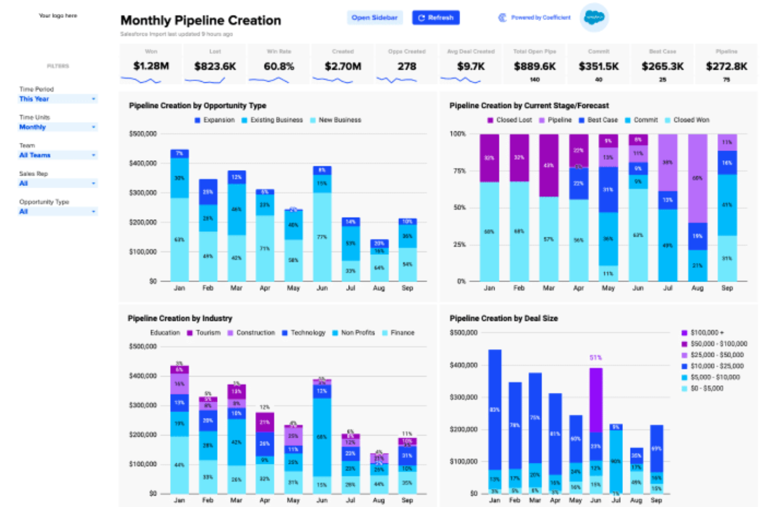
For professionals seeking an intuitive visual analytics tool, Coefficient offers the integration of Google Sheets and Excel with over 100 data sources. This tool is ideal for teams across various industries, including finance, marketing, and business intelligence, as it enables the creation of live analyses and dashboards powered by AI.
By automating data collection and facilitating data-driven decision-making, Coefficient addresses the needs of those looking to enhance their data management and reporting capabilities without coding expertise.
Why I Picked Coefficient
I picked Coefficient because it stands out for its ability to transform spreadsheets into dynamic data applications for easy visual reporting. This is particularly beneficial for those looking to create interactive dashboards and automated alerts directly within tools like Google Sheets.
Coefficient's AI-driven data cleaning and modeling capabilities enhance the accuracy and reliability of your analyses. These features make it an attractive choice for teams aiming to support their analytics processes.
Coefficient Key Features
In addition to its unique capabilities, Coefficient offers several other features that further its utility as a visual analytics tool.
- Import Agent: Connects spreadsheets to various systems, allowing for easy data importation.
- API Agent: Enables users to build custom connectors for more tailored data integration solutions.
- Browser Agent: Facilitates the scraping of live data, keeping your analyses up-to-date with real-time information.
- Automated Alerts: Set up notifications via Slack or email to stay informed about significant data changes.
Coefficient Integrations
Integrations include Salesforce, QuickBooks, Snowflake, HubSpot, Google Analytics, Slack, and more. Coefficient also allows for building custom connectors and scraping data from websites.
Pros and Cons
Pros:
- Offers a user-friendly interface for non-technical users
- Allows live data analysis directly within spreadsheets
- Enables creation of interactive dashboards without coding
Cons:
- Dependence on third-party integrations for full functionality
- Customization options might be limited for complex needs

Signara is an agentic analytics platform for marketing teams that automates KPI calculations, generates AI-driven narratives, and produces decision-ready dashboards and reports from connected data sources.
Who Is Signara Best For?
Signara is a good fit for marketing and revenue teams that need automated reporting across multiple data sources without relying on a data analyst or BI specialist.
Why I Picked Signara
I've included Signara in my top picks because it connects directly to marketing data sources like HubSpot, BigQuery, and Google Sheets, then transforms that raw data into decision-ready dashboards. What I find compelling is its deterministic KPI engine, which calculates every metric with auditable formulas so no number is guessed or invented. I also like that outputs include AI-generated narratives alongside the visuals, which links each figure directly back to its source data.
Signara Key Features
- PPTX export: Generate a formatted, presentation-ready PowerPoint deck directly from your connected data in one click.
- Driver analysis: Automatically identifies which metrics moved, in which direction, and by how much across your reporting period.
- AI-generated recommendations: Each report surfaces prioritized next steps (labeled Growth, Watch, or Action) based on the underlying KPI changes.
- Multi-format data ingestion: Connect live data from cloud warehouses like Snowflake and Databricks, or upload flat files via Excel, CSV, or JSON.
Signara Integrations
Signara connects to data sources including HubSpot, BigQuery, Snowflake, PostgreSQL, MySQL, Google Sheets, GA4, and Databricks, and also accepts file uploads via Excel, CSV, and JSON.
Pros and Cons
Pros:
- Flags data quality issues before reporting
- Deterministic math prevents AI number hallucinations
- Automated reports need zero analyst hours
Cons:
- Setup requires high data cleanliness
- No self-serve API on standard plans

DashThis is an online reporting tool that helps marketers create visual analytics dashboards by pulling together data from multiple sources. It automates data fetching so your dashboards stay up to date without manual updates.
Why I picked DashThis: I picked DashThis because it offers a blend of analytics and visualization tools tailored for marketing, rather than being a generic BI platform. For example, its AI insights feature automatically interprets your data, highlights wins, spots issues, and suggests actions — which helps turn data into a narrative without extra manual work. Another reason is its support for custom data sources — via CSV import — so you can bring in metrics not supported by native integrations, and the platform treats them like first-class data for visualization and insight.
DashThis Standout Features and Integrations
Standout features include comment boxes and notes, which let you annotate specific parts of the dashboard so your viewers understand the context behind a number, rather than just seeing raw visuals. You can also clone dashboards or save templates, which helps you reuse visual analytics layouts across clients or campaigns without rebuilding from scratch.
Integrations include Google Analytics, Google Ads, Facebook, Instagram, LinkedIn, TikTok, HubSpot, Mailchimp, Ahrefs, Bing Ads, SEMrush, and YouTube.
Pros and Cons
Pros:
- White label and branding options included
- Strong support for combining multiple data sources
- Excellent data visualization for marketing dashboards
Cons:
- Limited to marketing analytics visualization
- Customization of campaign-level filters can be tricky
Best for connecting all your data sources to one visual analytics tool

As a metric-centric BI and analytics platform, Klipfolio prioritizes getting your data centralized in one place through versatile, flexible integrations. Once your data is on Klipfolio, you can use data preparation, cleaning, and visualization tools to develop custom dashboards and reports to keep your team informed and motivated.
Why I picked Klipfolio: This visual analytics tool deserves a spot on my list because of the PowerMetrics feature. This self-serve tool encourages teams to explore and track their business data, instantly segmenting and filtering the information in a way that provides more actionable insights. You can also preserve your historical data for better forecasting and trend spotting.
Klipfolio Standout Features and Integrations
Standout features include custom metric creation for instant calculations, continual data updates using your data feeds, and a metric warehouse for data storage, accessibility, and management.
Integrations include Google Drive, HubSpot CRM, Intercom, Intuitive, Jira, LiveAgent, Mailchimp, Microsoft Excel, Slack, and Trello. Klipfolio has pre-built connectors and REST API integrations, as well as connection for spreadsheets, JSON files, and SQL databases.
Pros and Cons
Pros:
- Simple to set up and implement
- Easy connections and integrations
- Very user-friendly interface
Cons:
- Free plan has a lot of limitations
- Data refresh rates based on tiered pricing
Infogram
Best for creating engaging infographics and reports in just a few minutes

As a web-based infographic creation tool, Infogram focuses on data visualization through interactive dashboards, graphics, reports, and content that strives to drive more traffic to your site. With a lightweight editor, you can customize everything about your data visualizations, including style, color, logos, and display options, as well as royalty-free images, GIFs, and icon usage.
Why I picked Infogram: I like this tool because it’s the solution with the most templates available for easy insertion. Infogram has over 550 maps, 35 charts, and 20 pre-built design templates, images, and icons for drag-and-drop editing. Combine these templates with data from multiple sources, and you can get results directly in the editor through native integrations, cloud services, and spreadsheet uploads.
Infogram Standout Features and Integrations
Standout features include drag-and-drop editing format to simplify interactive chart and graphic creation, live data feeds that update your visualizations in real-time with no manual work needed, and simplified publishing to your website or social media channels through AMP, Medium Stories, or CMS.
Integrations include Brandcast, Dropbox, Genially, Giphy, Google Drive, Google Sheets, JSON feed, Microsoft OneDrive, MySQL, and YouTube.
Pros and Cons
Pros:
- Very user-friendly with a short learning curve
- Customizable themes for any industry or purpose
- Massive selection of templates
Cons:
- No offline functionality or features
- Not ideal for printed media

This analytics platform is designed to help your managers and team leads surface live data for their team and share it across the entire organization. You can build visualizations directly in your dashboard using a drag-and-drop interface to highlight the essentials with bar charts, infographics, and other interactive visualizations.
Why I picked Geckoboard: The platform made my list because of its sharing features, including the ability to share dashboards directly to Slack or to other devices. Automate KPI reports for your remote team that regularly posts to your Slack channels or sends your data to the big screen for in-office updates and meetings.
Geckoboard Standout Features and Integrations
Standout features include customizable dashboards for reporting by team or department, ad hoc analysis that pulls information from a variety of data sources, and visual analytics with charts, graphs, and maps.
Integrations include ActiveCampaign, Asana, Campaign Monitor, Dixa, Freshdesk, Google AdSense, Highrise, Intercom, monday.com, and Pipedrive. Geckoboard has over 80 pre-built integrations.
Pros and Cons
Pros:
- Robust tutorials and customer support
- Huge list of built-in integration options
- Implementation and launch in just a few minutes
Cons:
- Limited visualization template options
- Cost is higher than other similar platforms

This visual analytics tool strives be your comprehensive dashboard app for monitoring and analyzing data from disparate sources in one single location. You can use the various tools from Cyfe to develop dashboards for every purpose, including focusing on clients, web analytics, social media, and marketing.
Why I picked Cyfe: One cool feature from this platform is the Starter Dashboard, where you can get set up in just a few minutes. With this type of dashboard you configure pre-populated widgets that automatically pull data and build your dashboard for you. You can then update and edit the dashboard to better fit your needs.
Cyfe Standout Features and Integrations
Standout features include pre-built widgets that pull data from other popular tech tools, automated report creation and notifications, and historical data management for reliable storage and reference.
Integrations include Facebook, Google Ads, Google Analytics, Mailchimp, PayPal, Salesforce Sales Cloud, Slack, Trello, Twitter, and WordPress.
Pros and Cons
Pros:
- Simple and straightforward to use
- Massive amount of integration options
- One-click widget creation
Cons:
- No mobile application, desktop only
- Limited reporting customization options

This cloud-based analytics platform is designed to deliver custom analytics dashboards that incorporate data from a variety of sources that can be viewed on any device. Use Databox to design and build KPI dashboards with a drag-and-drop editor, customize views by adding unique metrics and visualizations, and control user access through permissions and IP addresses.
Why I picked Databox: One of the coolest features from this platform is the custom metrics builder. With this tool, you can get a more granular view of company performance without any data exploration or manipulation. Define the dimensions and filters you care about for more specific reports without any query languages like Javascript.
Databox Standout Features and Integrations
Standout features include dashboard designer for custom visualizations that pulls data from your tech ecosystem, code-free data calculations for conversion rates and ROI, and KPI scorecards that keep your team informed through push notifications, email, and Slack.
Integrations include Ahrefs, Facebook Pages, Google Analytics 4, HubSpot CRM, Mailchimp, Salesforce Sales Cloud, Shopify, Snapchat Ads, TikTok Ads, and YouTube.
Pros and Cons
Pros:
- Accessible and knowledgeable customer support
- Very easy to set up
- Friendly and intuitive user interface
Cons:
- Limited customization for dashboard layout
- Limited analytics capabilities and reporting
Best for two-way reports that strive to improve productivity

As a visual analytics tool that prioritizes two-way communication, Easy Insight is designed to track key metrics across your entire organization to help drive goals forward. You can connect with a massive range of SaaS applications with just a few clicks and use prebuilt dashboards to help you see your data right away — no coding necessary.
Why I picked Easy Insight: A feature that made me add this tool to my list is the focus on two-way reporting and communication. All of your SaaS data integrates directly into reports in real time so you can filter down tasks throughout multiple projects and pipelines for more accuracy and faster decision-making.
Easy Insight Standout Features and Integrations
Standout features include embedded analytics on custom dashboards, prebuilt dashboard templates, and custom reports with your choice of bars, graphs, maps, and charts.
Integrations include Asana, Basecamp, Cin7, Jira, Katana, Mailchimp, Salesforce Sales Cloud, SurveyMonkey, Trello, and Xero.
Pros and Cons
Pros:
- Responsive customer support
- Seamless data integration
- User-friendly interface
Cons:
- Limited formatting functionality for dashboards
- Number of SaaS connections limited by plan type

Grow BI is an analytics and visualization platform that uses full-stack BI to empower everyone on your team to make data-based decisions. This tool combines ETL, visualizations, and data warehousing into one platform that helps your organization connect, explore, and experiment with data to surface new insights that encourage everyone to take action.
Why I picked Grow BI: The unique thing about this tool is its pricing model. Most of the software options on this list limit the number of users that have access based on a user-licensing model. With Grow BI, you have unlimited user licensing that provides access to your entire organization so nobody needs to wait on a data analyst for information.
Grow BI Standout Features and Integrations
Standout features include interactive visualizations for dashboards and reporting, point and click tools that eliminate the need for SQL queries, and automated data pipelines that refresh your data on a schedule.
Integrations include Dropbox, Facebook Ads, Google Analytics, Google Sheets, HubSpot CRM, Instagram, MySQL, QuickBooks Online, Salesforce Sales Cloud, and Stripe. Grow BI offers native integrations for over 40 apps.
Pros and Cons
Pros:
- Lots of native integration options
- Digestible data bites for dashboards and reports
- Easy to use features and functionality
Cons:
- Limited export capabilities
- No storytelling or insight features
Other Visual Analytics Tools
Here are some additional visual analytics tools options that didn’t make it onto my shortlist, but are still worth checking out:
- GoodData
For leveraging cloud BI and artificial intelligence for analytics
- Athenic
For AI-powered deep data analysis
- ChartBlocks
For controlling every aspect of your data visualization with custom options
- Datawrapper
For replacing static reports with interactive presentations
- Grapher
For use by scientists and engineers
- Exago BI
For building reports and dashboards in Excel
- Qlik
Visual analytics tool for leveraging traditional and generative AI to get the most out of both
- iDashboards
For onsite and cloud-based versatility to customize data management
- Zoho Analytics
For aggregating data from any number of integrations — from the most common to the most obscure
- Visme
All-in-one platform for data visualizations, document management, and presentations
- Toucan
For customer-facing data storytelling that’s readable for inexperienced users
- Panintelligence
For expanding ARR through embedded analytics designed for SaaS needs
- Spotfire
For analyzing data at-rest and in-motion to predict and track trends via embedded analytics
- Tableau Desktop
For transparent pricing plans that help you better target the needs of your organization


Visual Analytics Tool Selection Criteria
When selecting the best visual analytics tools to include in this list, I considered common buyer needs and pain points like ease of data integration and customization capabilities. I also used the following framework to keep my evaluation structured and fair:
Core Functionality (25% of total score)
To be considered for inclusion in this list, each solution had to fulfill these common use cases:
- Create interactive dashboards
- Generate data visualizations
- Provide real-time data updates
- Support multiple data source connections
- Offer customizable reporting
Additional Standout Features (25% of total score)
To help further narrow down the competition, I also looked for unique features, such as:
- Advanced predictive analytics
- Custom branding capabilities
- Mobile access and compatibility
- Real-time collaboration tools
- AI-driven insights
Usability (10% of total score)
To get a sense of the usability of each system, I considered the following:
- Intuitive user interface
- Ease of navigation
- Clear and concise instructions
- Minimal learning curve
- Aesthetic design
Onboarding (10% of total score)
To evaluate the onboarding experience for each platform, I considered the following:
- Availability of training videos
- Access to interactive product tours
- Pre-built templates for quick setup
- Responsive chatbots for assistance
- Scheduled webinars for deeper understanding
Customer Support (10% of total score)
To assess each software provider’s customer support services, I considered the following:
- 24/7 support availability
- Multiple support channels
- Dedicated account managers
- Comprehensive knowledge base
- Quick response times
Value For Money (10% of total score)
To evaluate the value for money of each platform, I considered the following:
- Competitive pricing plans
- Range of features offered
- Flexibility in pricing options
- Discounts for annual subscriptions
- Satisfaction with cost vs. functionality
Customer Reviews (10% of total score)
To get a sense of overall customer satisfaction, I considered the following when reading customer reviews:
- Overall satisfaction ratings
- Feedback on feature usefulness
- Comments on customer service quality
- Reports on system reliability
- User recommendations to others
How to Choose Visual Analytics Tool
It’s easy to get bogged down in long feature lists and complex pricing structures. To help you stay focused as you work through your unique software selection process, here’s a checklist of factors to keep in mind:
| Factor | What to Consider |
|---|---|
| Scalability | Can the tool grow with your business? Consider if it can handle increased data volume and users. Look for flexibility in expanding features as your needs evolve. |
| Integrations | Does it connect with your existing systems? Ensure it supports the platforms you use daily, like CRM or ERP systems, to avoid manual data transfers. |
| Customizability | Can you tailor the tool to fit your workflows? Check if you can adjust dashboards and reports to match your team's specific needs without needing developer support. |
| Ease of use | Is it intuitive for all team members? Evaluate the learning curve and whether your team can adopt it quickly without extensive training or technical skills. |
| Implementation and onboarding | How quickly can you get started? Consider the resources needed for setup and the support offered during onboarding. Look for tools with guided setups and tutorials. |
| Cost | Does it fit your budget? Compare pricing plans and assess the value based on features offered. Watch out for hidden costs or fees for additional users. |
| Security safeguards | Are your data and insights protected? Ensure the tool has robust security measures, like encryption and user access controls, to keep sensitive information safe. |
What Are Visual Analytics Tools?
Visual analytics tools are software products that help users create visual representations of data to enhance understanding and insights. Typically used by data analysts, marketers, and business intelligence professionals, these tools provide value by making complex data more accessible and actionable. Features like interactive dashboards, real-time data updates, and customizable reports help with data interpretation and decision-making. Overall, these tools simplify the process of turning raw data into meaningful insights.
Features
When selecting visual analytics tools, keep an eye out for the following key features:
- Interactive dashboards: Enable users to explore data visually and gain insights through dynamic charts and graphs.
- Real-time data updates: Allow for immediate reflection of changes in data, aiding in timely decision-making.
- Customizable reports: Provide flexibility to tailor reports to specific business needs and preferences.
- Data source connections: Facilitate integration with multiple data sources to centralize insights in one platform.
- AI-driven insights: Suggest optimal visual formats and uncover patterns that might not be immediately obvious.
- Collaboration tools: Support teamwork by allowing multiple users to access and edit dashboards simultaneously.
- Security measures: Protect sensitive data with encryption and user access controls.
- Mobile access: Offer the ability to view and interact with data on-the-go via mobile devices.
- Prebuilt templates: Speed up the creation of visualizations with ready-to-use formats for common use cases.
Benefits
Implementing visual analytics tools provides several benefits for your team and your business. Here are a few you can look forward to:
- Improved decision-making: Real-time data updates and interactive dashboards help your team make informed decisions quickly.
- Enhanced data comprehension: Visual representations of complex data simplify understanding and uncover insights that might be missed in raw data.
- Increased efficiency: Customizable reports and prebuilt templates save time by reducing manual data processing and report creation.
- Better collaboration: Features that allow multiple users to access and edit data simultaneously foster teamwork and shared insights.
- Greater data security: Built-in security measures protect your sensitive information, providing peace of mind.
- Flexibility in data handling: Integration with various data sources centralizes information, making it easier to manage and analyze.
Costs & Pricing
Selecting visual analytics tools requires an understanding of the various pricing models and plans available. Costs vary based on features, team size, add-ons, and more. The table below summarizes common plans, their average prices, and typical features included in visual analytics tools solutions:
Plan Comparison Table for Visual Analytics Tools
| Plan Type | Average Price | Common Features |
|---|---|---|
| Free Plan | $0 | Basic data visualization, limited templates, and community support. |
| Personal Plan | $5-$25/user/month | Interactive dashboards, real-time updates, and customizable reports. |
| Business Plan | $30-$75/user/month | Multiple data source connections, collaboration tools, and enhanced security measures. |
| Enterprise Plan | $100-$200/user/month | Advanced analytics, dedicated support, and extensive integration options. |
Visual Analytics Tools FAQs
Here are some answers to common questions about visual analytics tools:
What are the three types of data visualization tools?
There are three main ways to visualize your data, including charts, maps, and tables. Charts will display data in pie charts, graphs, plots, and diagrams. Maps show your data geospatially with color coding, icons, and markers. Tables visualize your data numerically in columns and rows, like an Excel spreadsheet.
How do visual analytics tools handle data security?
Yes, visual analytics tools typically include security measures to protect your data. They employ encryption, user access controls, and regular security updates to safeguard sensitive information. When evaluating a tool, check for compliance with data protection regulations like GDPR or CCPA. It’s important to ensure the tool aligns with your organization’s security policies and practices.
Do visual analytics tools require technical expertise to use?
No, many visual analytics tools are designed to be user-friendly and don’t require advanced technical skills. They offer intuitive interfaces, drag-and-drop features, and guided setups to help new users. However, having some data literacy can enhance your ability to maximize the tool’s potential. Training resources and tutorials can also help your team get up to speed.
What’s Next:
If you're in the process of researching visual analytics tools, connect with a SoftwareSelect advisor for free recommendations.
You fill out a form and have a quick chat where they get into the specifics of your needs. Then you'll get a shortlist of software to review. They'll even support you through the entire buying process, including price negotiations.