10 Best Dashboard Software Reviewed In 2026

Best Dashboard Software Shortlist


Dashboard software helps you turn complex data into clear, visual insights so you can make smarter decisions faster. By centralizing your key metrics and reports in one place, you get a real-time snapshot of your business—no more sifting through spreadsheets or guessing what matters most.
I've tested the top dashboard software for revenue operations professionals, so let's break down the best options to help you pick the right one for your team’s needs.
Why Trust Our Software Reviews
We’ve been testing and reviewing RevOps software since 2022. As RevOps leaders ourselves, we know how critical and difficult it is to make the right decision when selecting software.
We invest in deep research to help our audience make better software purchasing decisions. We’ve tested more than 2,000 tools for different RevOps use cases and written over 1,000 comprehensive software reviews. Learn how we stay transparent & our software review methodology.
Best Dashboard Software Summary
This comparison chart summarizes pricing details for my top dashboard software selections to help you find the best one for your budget and business needs.
| Tool | Best For | Trial Info | Price | ||
|---|---|---|---|---|---|
| 1 | Best with omnichannel identity stitching | Free trial + free demo available | Pricing upon request | Website | |
| 2 | Best for spreadsheet-native live dashboards | Free plan available | From $49/month (billed annually) | Website | |
| 3 | Best for marketing agencies | 14-day free trial + free demo available | From $44/month (billed annually) | Website | |
| 4 | Best for low-code dashboard creation | Free plan available | From $20/developer/month | Website | |
| 5 | Best for unified security and observability | 60-day free trial | Pricing upon request | Website | |
| 6 | Best for small businesses | 14-day free trial | From $120/month (billed annually) | Website | |
| 7 | Best for visual data analysis | Free plan available | From $15/user/month (billed annually) | Website | |
| 8 | Best for all-in-one business dashboards | 14-day free trial available | From $29/month | Website | |
| 9 | Best for SQL-based analysis | Free trial + free demo available | From $25/user/month (billed annually) | Website | |
| 10 | Best for mobile access | Free plan + free trial + free demo available | From $64/month (billed annually) | Website |
-

Prisync
Visit WebsiteThis is an aggregated rating for this tool including ratings from Crozdesk users and ratings from other sites.4.7 -
Expedite Commerce
Visit Website -
QuickBooks Online
Visit WebsiteThis is an aggregated rating for this tool including ratings from Crozdesk users and ratings from other sites.4


Best Dashboard Software Reviews
Below are my detailed summaries of the best dashboard software that made it onto my shortlist. My reviews offer a detailed look at the key features, pros & cons, integrations, and ideal use cases of each tool to help you find the best one for you.
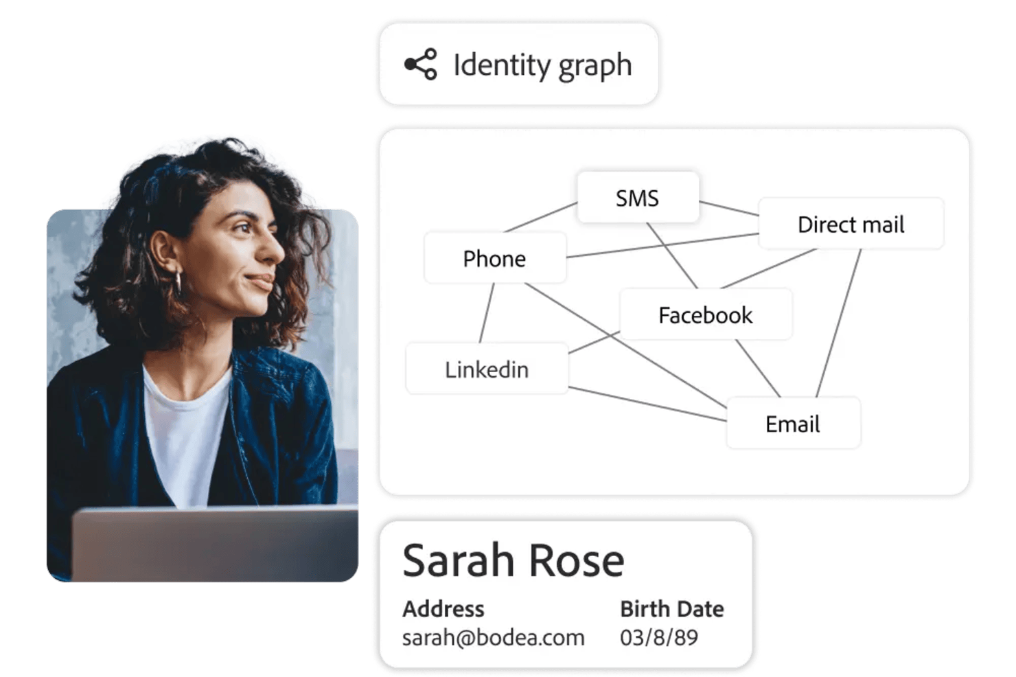
Adobe Customer Journey Analytics is a dashboard software platform for analyzing, visualizing, and exploring customer journey data across multiple channels and data sources.
Who Is Adobe Customer Journey Analytics Best For?
Enterprise analytics teams in retail, finance, or media who need to unify and analyze customer data from multiple channels.
Why I Picked Adobe Customer Journey Analytics
I picked Adobe Customer Journey Analytics as one of the best because I can unify customer data from web, mobile, and offline sources using its omnichannel identity stitching. My team is able to visualize complete customer journeys in a single dashboard, connecting touchpoints across channels. I also like how the platform lets us analyze user behavior with granular segmentation based on unified profiles.
Adobe Customer Journey Analytics Key Features
- Custom dashboard builder: Create and personalize dashboards with drag-and-drop widgets and visualizations.
- Real-time data streaming: Access up-to-the-minute data for live monitoring and reporting.
- Advanced calculated metrics: Build custom metrics using formulas and logic tailored to your analysis needs.
- Collaboration tools: Share dashboards and reports with team members and set permissions for access and editing.
Adobe Customer Journey Analytics Integrations
Adobe Customer Journey Analytics offers native integrations with Adobe Journey Optimizer, Adobe Real-Time CDP, Adobe Campaign, and Adobe Target. It is built on Adobe Experience Platform and provides an API for custom integrations.
Pros and Cons
Pros:
- Real-time anomaly detection in dashboards
- Advanced journey path and attribution analysis
- Omnichannel identity stitching for unified profiles
Cons:
- Limited native integrations outside Adobe ecosystem
- No transparent pricing or self-serve signup
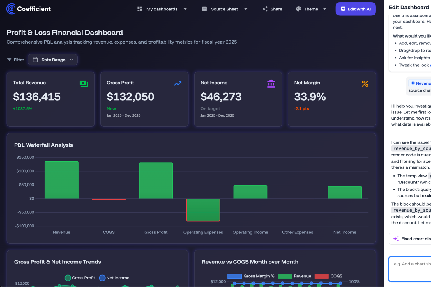
For businesses and teams seeking a dynamic dashboard solution, Coefficient offers a unique blend of data integration and visualization capabilities. It appeals to professionals across various industries, such as finance, marketing, and operations, who need to transform static spreadsheets into interactive, data-driven dashboards.
Why I Picked Coefficient
I picked Coefficient because it excels in transforming traditional spreadsheets into interactive dashboards. Its standout feature is the ability to connect Google Sheets and Excel to over 100 data sources, which allows you to build live dashboards with real-time data. Another compelling feature is its AI-powered data cleaning and transformation tools, which simplify complex data processes directly within your spreadsheets. This integration and automation capability make Coefficient an ideal tool for those who want to improve data accuracy and speed up decision-making without extensive technical expertise.
Coefficient Key Features
In addition to its integration and automation capabilities, I also found the following features valuable for dashboard creation:
- Interactive Web Dashboards: Create and customize dashboards that can be shared across teams, enhancing collaboration and data visibility.
- Automated Alerts: Set up notifications to receive alerts via Slack or email whenever data changes, ensuring you never miss critical updates.
- Pre-built Templates: Utilize a variety of templates designed for specific business needs, such as financial forecasts and marketing dashboards, to jumpstart your projects.
- Custom Connectors: Develop tailored connections to specific data sources, allowing for more personalized and comprehensive data integration.
Coefficient Integrations
Integrations include Salesforce, QuickBooks, Snowflake, HubSpot, MySQL, PostgreSQL, Redshift, Tableau, and more.
Pros and Cons
Pros:
- Intuitive sidebar interface for non-coders
- Simplifies complex SQL data pulls
- Offers real-time data syncing
Cons:
- Dependency on Google Sheets and Excel
- Basic data transformation options

DashThis is a reporting dashboard tool designed for marketing agencies to consolidate data from various sources into one platform. It simplifies the process of creating and sharing reports with clients, saving time and effort.
Why I picked DashThis: DashThis provides an intuitive platform specifically tailored for marketing agencies. Its automated reporting feature allows you to generate reports quickly without manual data entry, while its customizable templates help your team create visually appealing reports. Overall, DashThis is ideal for agencies looking to streamline their reporting processes.
Standout features & integrations:
Features include automated reporting that reduces the time spent on manual tasks, customizable templates that allow you to create professional-looking reports suited to your agency's style and an intuitive interface.
Integrations include Google Analytics, Facebook Ads, Instagram Insights, LinkedIn Ads, Twitter, Mailchimp, Moz, HubSpot, YouTube, and Shopify.
Pros and Cons
Pros:
- Tailored for marketing metrics
- Quick automated reporting
- Customizable report templates
Cons:
- Limited advanced customization
- Basic data visualization options
New Product Updates from DashThis

DashThis Adds Calculated Widgets for Cross-Platform Metrics
DashThis introduces Calculated Widgets for building custom cross-platform metrics. The new feature lets users combine metrics from multiple integrations, customize formatting, and display trends without manual calculations. For more information, visit DashThis's official site.
 .
.
UI Bakery empowers businesses to create dynamic dashboards and internal tools without extensive coding knowledge. Ideal for companies aiming to streamline operations and enhance customer engagement, this platform offers a user-friendly interface to integrate data and automate workflows seamlessly.
Why I Picked UI Bakery
I picked UI Bakery because it blends low-code ease with real control over data and logic, helping you build dashboards that connect directly to your databases (SQL, NoSQL or APIs) and let you visualize real-time data and analytics. Its drag-and-drop UI builder, combined with data-source integration, makes it straightforward to get a working dashboard or internal tool up quickly. I appreciate that you can add custom logic — using SQL or JavaScript — so if your data needs transformation or filtering before display, you’re not limited by the visual builder.
For teams managing complex or evolving datasets, this mix of ease and flexibility means you don’t have to choose between speed and power.
UI Bakery Key Features
Aside from the features tied to data connection and logic control that I mentioned above, you’ll also get:
- Pre-built components library: a wide variety of components (tables, charts, forms, modals, etc.) you can drag into your UI to build dashboards or internal tools.
- Visual workflow/automation builder: build automations or CRUD workflows to fetch, insert, update or delete data — useful for dashboards that double as management tools.
- Responsive design & theming: create interfaces that adapt to different screen sizes, and apply custom branding, styles, and formatting to match your organization’s look.
- Version control & deployment options: manage app versions, track history, and deploy either on UI Bakery’s cloud or self-hosted infrastructure, giving flexibility on hosting and release management.
UI Bakery Integrations
Integrations include MySQL, PostgreSQL, Salesforce, Twilio, AWS, Google Sheets, HubSpot, MongoDB, Firebase, and REST API.
Pros and Cons
Pros:
- Templates and prebuilt dashboards reduce time to launch dashboard apps
- Supports many data sources including SQL, NoSQL, APIs and sheets
- Allows building dashboards and internal tools without full-stack developers
Cons:
- Template variety and visual styling options can feel limited for highly specialized dashboard designs
- Customization beyond built-in components can require coding knowledge
New Product Updates from UI Bakery

UI Bakery Adds App Folders and New Managed Python Libraries
UI Bakery introduces app folders for better application organization and expands its managed Python runtime with new built-in libraries. These updates help teams organize projects more efficiently while supporting additional Python-based workflows. For more information, visit UI Bakery's official site.
 .
.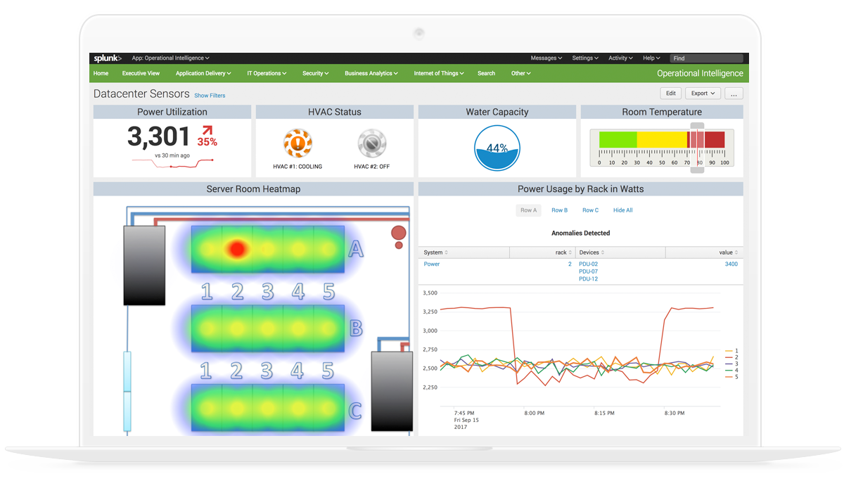
Splunk Enterprise brings together data ingestion, search-based analytics, and a visual dashboard builder for monitoring logs, metrics, and events across IT, security, and operational environments.
Who is Splunk Enterprise Best For?
Splunk Enterprise is well suited for enterprise IT, security, and DevOps teams that need to monitor and analyze high volumes of machine-generated data.
Why I Picked Splunk Enterprise
I've included Splunk Enterprise in my top picks because it's one of the few dashboard platforms that genuinely unifies security and observability data in a single view. Using Dashboard Studio, I can build real-time dashboards that pull from both security event logs and infrastructure metrics simultaneously, without switching tools. I also like that it supports pre-built dashboards for threat detection and service health side by side, so my team can correlate a spike in failed logins with a surge in CPU usage on the same screen.
Splunk Enterprise Key Features
- SPL-based data querying: Use Splunk's Search Processing Language to write custom queries for individual dashboard panels with precise, filtered data.
- Trellis layout: Split a single visualization into multiple panels, each scoped to a different field value, within the same dashboard view.
- Dynamic drilldowns: Configure dashboard panels to link to searches, other dashboards, or external URLs when a data point is clicked.
- Role-based dashboard permissions: Control which users or groups can view, edit, or publish specific dashboards across your Splunk environment.
Splunk Enterprise Integrations
Splunk Enterprise offers more than 2,300 marketplace integrations through Splunkbase, including add-ons for AWS, ServiceNow, Jira, Slack, PagerDuty, Microsoft Azure, Google Cloud Platform, and Kubernetes. It also provides SDKs, APIs, and developer tools for building custom integrations.
Pros and Cons
Pros:
- Free machine learning toolkit is included
- Dashboards provide a single source of truth during incidents
- SPL query language handles complex cross-source correlations
Cons:
- On-premise deployments require substantial infrastructure resources
- Creating polished dashboards requires significant time

Klipfolio is a cloud-based dashboard platform designed for small businesses and startups. It allows users to create real-time business dashboards to visualize and track key performance metrics.
Why I picked Klipfolio: Klipfolio offers an intuitive dashboard experience tailored to small businesses. It provides pre-built templates that simplify the creation of dashboards, making it accessible even if your team isn't technically inclined, while the software’s focus on real-time data ensures you're always up-to-date with your business metrics. All in all, its affordability and ease of use make it a practical choice for startups and small teams.
Standout features & integrations:
Features include pre-built templates that help you set up dashboards quickly, real-time data visualization to keep your team informed with the latest metrics, and customization options that let you tailor dashboards to specific business needs.
Integrations include Google Analytics, Salesforce, Facebook Ads, HubSpot, Twitter, Stripe, Shopify, LinkedIn Ads, Xero, and QuickBooks.
Pros and Cons
Pros:
- Affordable for small teams
- Quick setup with templates
- Cloud-based accessibility
Cons:
- Limited advanced features
- Can be slow with big data

Tableau is a data visualization tool used primarily by analysts and business intelligence professionals. It helps users turn raw data into interactive and shareable dashboards that facilitate insightful decision-making.
Why I picked Tableau: Tableau excels at visualizing complex data sets into easy-to-understand formats. Its drag-and-drop interface allows you to create interactive charts and graphs quickly, and its ability to handle large volumes of data without performance issues is noteworthy. The software also offers extensive customization options, making it ideal for detailed data analysis.
Standout features & integrations:
Features include intuitive drag-and-drop functionality, interactive dashboards, sophisticated data visualization capabilities, chart and graph customization, and visual data analysis.
Integrations include Salesforce, Google Analytics, Microsoft Excel, Amazon Redshift, Oracle NetSuite, SAP HANA, Teradata, Snowflake, Google BigQuery, and Splunk.
Pros and Cons
Pros:
- Handles large data sets
- Extensive customization options
- Interactive data visualizations
Cons:
- Requires training for complex tasks
- Steep learning curve for beginners

Cyfe is a business dashboard solution designed for companies looking to consolidate data from multiple sources into a single view. It allows businesses to monitor and analyze performance metrics across different departments.
Why I picked Cyfe: Cyfe offers an advanced platform for monitoring various business metrics in one place. It provides pre-built widgets that make setting up dashboards quick and easy for your team. Plus, the tool's all-in-one approach helps you track marketing, sales, finance, and more without switching platforms. With its focus on holistic business views, Cyfe simplifies the process of data consolidation while improving user experience.
Standout features & integrations:
Features include an array of pre-built widgets that let you start tracking data right away, all-in-one business dashboards to help you keep an eye on metrics across different departments, and a user-friendly interface.
Integrations include Google Analytics, Salesforce, Facebook, Twitter, Mailchimp, QuickBooks, Shopify, Wordpress, Instagram, and LinkedIn.
Pros and Cons
Pros:
- Comprehensive data consolidation
- Easy setup with widgets
- Tracks multiple business metrics
Cons:
- Limited advanced analytics
- Basic visualization options
Mode is an advanced analytics platform tailored for data scientists and analysts who rely heavily on SQL for data exploration. It enables users to query data, create visualizations, and collaborate on data projects.
Why I picked Mode: Mode is designed for teams that need strong SQL integration, making data analysis more efficient. It allows you to run complex queries and visualize the results without switching between tools. The platform's collaboration features also let your team work together on data projects seamlessly. As a result, Mode is ideal for data-driven teams looking to derive insights from raw data.
Standout features & integrations:
Features include a SQL editor that supports complex queries, making data analysis straightforward and efficient. Mode also provides visualization tools that let you turn query results into interactive charts, and deep collaboration features to allow your team to share insights and work on data projects together.
Integrations include Salesforce, Google Analytics, Amazon Redshift, PostgreSQL, MySQL, BigQuery, Snowflake, Oracle NetSuite, SAP HANA, and Microsoft SQL Server.
Pros and Cons
Pros:
- Strong SQL capabilities
- Supports complex data queries
- Facilitates team collaboration
Cons:
- Basic visualization options
- May require technical support

Databox is a business analytics tool designed for marketing and sales teams to track performance metrics. It allows users to access data and insights on-the-go through its mobile-friendly dashboards.
Why I picked Databox: Databox offers a unique mobile experience, allowing your team to monitor KPIs from anywhere. Its pre-built templates make it easy to set up dashboards quickly, while its customizable alerts help you stay updated with real-time data. Additionally, the software’s mobile-first approach ensures you have access to critical metrics at all times, making data analysis simple and efficient.
Standout features & integrations:
Features include mobile-friendly dashboards to keep you connected to your data on-the-go, customizable alerts to ensure you never miss important updates, and pre-built templates to help your team set up and visualize data effortlessly.
Integrations include Google Analytics, HubSpot, Salesforce, Facebook Ads, QuickBooks, Shopify, Stripe, LinkedIn Ads, Instagram Insights, and Mailchimp.
Pros and Cons
Pros:
- Mobile-first design
- Quick setup with templates
- Real-time customizable alerts
Cons:
- Limited desktop functionalities
- Requires consistent internet access
Other Dashboard Software
Here are some additional dashboard software options that didn’t make it onto my shortlist, but are still worth checking out:
- Sisense
For embedded analytics
- Athenic
For AI-powered dashboards
- Microsoft Power BI
For integrating with Microsoft tools
- Grafana Cloud
For open-source monitoring
- Qlik Sense
For interactive dashboards
- FineBI 6.1
For self-service BI
- Geckoboard
For real-time KPI tracking
- Domo
For large enterprises
- Adverity
For marketing data integration
- Supermetrics
For data extraction
- Zoho Analytics
For cross-functional teams
- Insight Software
For embedded analytics solutions


Dashboard Software Selection Criteria
When selecting the best dashboard software to include in this list, I considered common buyer needs and pain points like data integration capabilities and user-friendly interfaces. I also used the following framework to keep my evaluation structured and fair:
Core Functionality (25% of total score)
To be considered for inclusion in this list, each solution had to fulfill these common use cases:
- Data visualization
- Real-time data updates
- Custom dashboard design
- Multi-source data integration
- Reporting and analytics
Additional Standout Features (25% of total score)
To help further narrow down the competition, I also looked for unique features, such as:
- Predictive analytics
- Embedded analytics capabilities
- Advanced data security
- AI-driven insights
- Mobile app accessibility
- Additional dashboard templates
- User authentication and permissions
Usability (10% of total score)
To get a sense of the usability of each system, I considered the following:
- Intuitive interface
- Ease of navigation
- Minimal learning curve
- Aesthetic design
- Customization options
Onboarding (10% of total score)
To evaluate the onboarding experience for each platform, I considered the following:
- Availability of training videos
- Interactive product tours
- Access to templates
- Webinars and workshops
- Supportive onboarding guides
Customer Support (10% of total score)
To assess each software provider’s customer support services, I considered the following:
- 24/7 support availability
- Response time
- Quality of assistance
- Access to help documentation
- Availability of live chat
Value For Money (10% of total score)
To evaluate the value for money of each platform, I considered the following:
- Competitive pricing
- Features offered for the price
- Scalability of pricing plans
- Hidden costs or fees
- Customer satisfaction with cost
Customer Reviews (10% of total score)
To get a sense of overall customer satisfaction, I considered the following when reading customer reviews:
- Overall satisfaction ratings
- Commonly mentioned pros and cons
- Feedback on feature usefulness
- User experience descriptions
- Support and service feedback
How to Choose a Dashboard Software
It’s easy to get bogged down in long feature lists and complex pricing structures. To help you stay focused as you work through your unique software selection process, here’s a checklist of factors to keep in mind:
| Factor | What to Consider |
| Scalability | Will this software grow with your team? |
| Integrations | Does it connect with your existing tools? |
| Customizability | Can you tailor it to fit your specific needs? |
| Ease of Use | Is it simple for your team to learn and use? |
| Budget | Does it fit within your financial constraints? |
| Security Safeguards | Does it meet your security and compliance requirements? |
| Support | Is there adequate customer support available? |
| Mobile Access | Can you access it easily on mobile devices? |
Trends In Dashboard Software
In my research, I sourced countless product updates, press releases, and release logs from different dashboard software vendors. Here are some of the emerging trends I’m keeping an eye on:
- AI-Driven Insights: More tools are using AI to provide deeper data insights. This helps users make informed decisions faster by analyzing patterns and predicting future trends.
- Customizable Visualizations: Users are looking for more personalization in their dashboards. Tools are now offering advanced customization options, allowing businesses to tailor visualizations to their specific needs. This trend makes it easier for teams to focus on metrics that matter most to them.
- Embedded Analytics: Businesses want analytics within their existing tools and workflows. Many vendors now offer embedded analytics solutions, letting users access insights without switching platforms.
- Focus on Data Privacy: As data regulations tighten, dashboard tools are enhancing their data privacy features. Ensuring compliance with regulations like GDPR is becoming a priority, and companies are integrating more advanced privacy controls. This trend addresses growing concerns about data security.
- Augmented Analytics: This trend involves using machine learning to automate data preparation and insight generation. It simplifies complex analysis, making it accessible to non-technical users.
What Is Dashboard Software?
Dashboard software empowers CROs and RevOps professionals to bring together data from multiple sources into a single, interactive view. By consolidating key revenue metrics and performance indicators, these platforms enable leaders to monitor pipeline health, track progress toward targets, and make informed, data-driven decisions. With features like customizable visualizations, AI-powered insights, and seamless analytics integration, dashboard software streamlines reporting and helps teams quickly identify opportunities and address challenges across the revenue operation.
Features of Dashboard Software
When selecting dashboard software, keep an eye out for the following key features:
- Data Visualization: Transforms raw data into visual formats like charts and graphs, making it easier to understand insights at a glance.
- Real-Time Data Updates: Provides up-to-the-minute information, allowing users to make timely and informed decisions.
- Customizable Dashboards: Allows users to tailor their dashboards to focus on the metrics that matter most to their specific needs.
- Multi-Source Data Integration: Combines data from various platforms, providing a comprehensive view of business performance in one place.
- AI-Driven Insights: Uses artificial intelligence to analyze data patterns and predict future trends, enhancing decision-making.
- Embedded Analytics: Integrates analytics directly into existing tools, enabling users to access insights within their workflow.
- Interactive Dashboards: Offers interactivity that lets users explore data in depth, uncovering detailed insights through dynamic visualizations.
- Data Privacy Controls: Ensures compliance with data regulations and protects sensitive information, addressing security concerns.
- Collaboration Features: Enables teams to share insights and work on data projects together, fostering a collaborative environment.
- Augmented Analytics: Automates data preparation and insight generation, making complex analysis accessible to non-technical users.
Benefits of Dashboard Software
Implementing dashboard software provides several benefits for your team and your business. Here are a few you can look forward to:
- Improved Decision-Making: Real-time data updates and AI-driven insights help your team make informed decisions quickly.
- Enhanced Data Understanding: Data visualization transforms complex data sets into easy-to-digest visuals, making insights clearer.
- Increased Efficiency: Customizable dashboards allow users to focus on key metrics, reducing time spent searching for information.
- Better Collaboration: Collaboration features enable teams to share insights easily and work together on data-driven projects.
- Greater Data Accessibility: Multi-source data integration brings all your data into one place, providing a comprehensive view of your business.
- Compliance and Security: Data privacy controls ensure your data meets regulatory requirements and remains secure.
- Empowered Non-Technical Users: Augmented analytics makes complex data analysis accessible, allowing more team members to engage with data.
Costs and Pricing of Dashboard Software
Selecting dashboard software requires an understanding of the various pricing models and plans available. Costs vary based on features, team size, add-ons, and more. The table below summarizes common plans, their average prices, and typical features included in dashboard software solutions:
Plan Comparison Table for Dashboard Software
| Plan Type | Average Price | Common Features |
| Free Plan | $0 | Basic data visualization, limited dashboards, and community support. |
| Personal Plan | $5-$25/user/month | Customizable dashboards, multi-source integration, and email support. |
| Business Plan | $30-$70/user/month | Real-time data updates, collaboration tools, and enhanced security features. |
| Enterprise Plan | $75-$150/user/month | Advanced analytics, dedicated support, and extensive customization options. |
Dashboard Software FAQs
Here are some answers to common questions about dashboard software:
What are some of the downsides to using dashboards?
Dashboards can sometimes lack real-time anomaly detection, which may prevent proactive incident management. They might also rely too heavily on historical data, potentially missing small incidents that could negatively impact your business. Over-reliance can lead to cluttered dashboards with false positives and a lack of intelligent prioritization.
Why do most dashboards fail?
Many dashboards fail because they include misaligned metrics that clutter the interface with unrelated data. This can distract users from key insights and lead to decision paralysis. When overwhelmed with information, decision-makers might struggle to draw actionable conclusions.
How can dashboards enhance business performance?
Dashboards enhance business performance by providing a clear overview of key metrics in real time. They help your team make informed decisions quickly and efficiently. By consolidating data from multiple sources, dashboards ensure that everyone has access to the same, up-to-date information.
Can dashboards be customized for different business needs?
Yes, most dashboard software allows customization to meet various business needs. You can tailor the layout, choose which metrics to display, and set up alerts for specific data points. This flexibility ensures that you get the most relevant insights for your business.
How do dashboards improve team collaboration?
Dashboards improve team collaboration by providing a centralized platform where everyone can access the same data. They enable real-time sharing of insights and findings, making it easier for teams to discuss and align on strategies. With shared dashboards, team members can contribute to data-driven projects more effectively.
What’s Next:
If you're in the process of researching dashboard software, connect with a SoftwareSelect advisor for free recommendations.
You fill out a form and have a quick chat where they get into the specifics of your needs. Then you'll get a shortlist of software to review. They'll even support you through the entire buying process, including price negotiations.