18 Best Sales Dashboard Software Reviewed in 2026

Best Sales Dashboard Software Shortlist
Here’s my shortlist of the best sales dashboard software:


Are you tired of sifting through endless data to find insights that matter for your sales team? You're not alone. Many revenue operations experts face the challenge of turning raw data into actionable insights. Sales dashboard software can help with sales analytics and setting sales goals.
In my experience testing and reviewing these tools, I've found they simplify data visualization and boost team productivity. You'll get a clear view of your sales performance, helping you make informed decisions.
In this article, I'll share my top picks for sales dashboard software. I'll provide unbiased, well-researched reviews to help you find the best fit for your needs. Let's make your data work for you.
Why Trust Our Software Reviews
Best Sales Dashboard Software Summary
This comparison chart summarizes pricing details for my top sales dashboard software selections to help you find the best one for your budget and business needs.
| Tool | Best For | Trial Info | Price | ||
|---|---|---|---|---|---|
| 1 | Best for custom dashboards | 14-day free trial available | From $120/month (billed annually) | Website | |
| 2 | Best for data visualization | Free demo available | From $75/user/month (billed annually) | Website | |
| 3 | Best for associative exploration | 30-day free trial available | From $200/10 users/month (billed annually) | Website | |
| 4 | Best for team visibility | 14-day free trial + free demo available | From $60/month (billed annually) | Website | |
| 5 | Best for business analytics | Free plan available | From $14/user/month (billed annually) | Website | |
| 6 | Best for sales engagement | Free demo available | Pricing upon request | Website | |
| 7 | Best for real-time data | 14-day free trial + free demo available | From $159/month | Website | |
| 8 | Best for data automation | 7-day free trial + free demo available | From $24/month (billed annually) | Website | |
| 9 | Best for small teams | Free 15-day trial available | From $23/user/month (billed annually) | Website | |
| 10 | Best for sales gamification | Free demo available | From $40/user/month | Website |
-

Prisync
Visit WebsiteThis is an aggregated rating for this tool including ratings from Crozdesk users and ratings from other sites.4.7 -
Expedite Commerce
Visit Website -
QuickBooks Online
Visit WebsiteThis is an aggregated rating for this tool including ratings from Crozdesk users and ratings from other sites.4


Best Sales Dashboard Software Reviews
Below are my detailed summaries of the best sales dashboard software that made it onto my shortlist. My reviews offer a detailed look at the key features, pros and cons, integrations, and ideal use cases of each tool to help you find the best one for you.
Klipfolio is a cloud-based business intelligence platform that allows businesses to create custom dashboards for real-time data visibility. It's used by small to medium-sized businesses and enterprises seeking to visualize data and track key performance indicators effectively.
Why I picked Klipfolio: It excels in custom dashboards, offering a flexible interface to tailor dashboards to your specific needs. You can pull data from multiple sources and use pre-built visualizations to display insights with the power and familiarity of spreadsheets. Klipfolio's ability to handle real-time data updates ensures your team always works with the latest information. In my experience, its customization options make it a versatile choice for various business needs.
Standout features and integrations:
Features include real-time data updates, pre-built visualizations, and flexible dashboard customization. You can tailor dashboards to fit your specific requirements and pull data from multiple sources. Klipfolio also offers interactive features to enhance data engagement.
Integrations include Google Analytics, Salesforce, HubSpot, Dropbox, SQL Server, QuickBooks, Shopify, Xero, Mailchimp, Zendesk, and more.
Pros and cons
Pros:
- Multiple data source support
- Real-time data updates
- Customizable dashboards
Cons:
- Dashboard performance can be slow with large datasets
- Some integrations require manual setup

Tableau is a data visualization tool aimed at helping businesses transform raw data into interactive and shareable dashboards. It's popular among data analysts, business intelligence professionals, and teams looking to visualize complex data sets.
Why I picked Tableau: It specializes in data visualization, offering an intuitive interface that allows you to create visually appealing dashboards. You can connect to various data sources and use drag-and-drop features to build your visuals. Tableau's ability to handle large data sets and perform real-time analysis sets it apart. In my experience, its robust visualization capabilities make it a favorite for teams that need detailed insights.
Standout features and integrations:
Features include a drag-and-drop interface, real-time data analysis, and the ability to handle large data sets. You can create visually appealing dashboards that deliver detailed insights. Tableau also provides interactive dashboard features for enhanced user engagement.
Integrations include Salesforce, Google Analytics, Amazon Redshift, Microsoft Excel, SQL Server, Oracle, Dropbox, Box, SAP, Splunk, and more.
Pros and cons
Pros:
- Real-time data analysis
- Drag-and-drop interface
- Can handle large data sets
Cons:
- High resource usage
- Steeper learning curve

Qlik is a data analytics and visualization platform designed for businesses aiming to leverage data for informed decision-making. It caters to data analysts, business intelligence professionals, and organizations looking to explore data in-depth through associative analytics.
Why I picked Qlik: It focuses on associative exploration, allowing you to discover hidden insights by connecting data points across various sources. Qlik's in-memory processing ensures fast data retrieval and analysis. You can create interactive dashboards that help your team visualize data relationships. In my experience, its unique associative model sets it apart from traditional linear analytics tools.
Standout features and integrations:
Features include in-memory processing, interactive dashboards, and data discovery tools. Your team can explore data relationships and uncover insights with Qlik's unique associative model. The platform also offers advanced analytics capabilities to support complex data exploration.
Integrations include Salesforce, SAP, Microsoft Dynamics, Google Analytics, AWS, Oracle, Excel, SQL Server, Snowflake, and more.
Pros and cons
Pros:
- Interactive dashboards
- Complex data exploration support
- Unique associative model
Cons:
- Technical expertise required
- Licensing and pricing structure may be difficult to understand

Geckoboard is a data visualization dashboard tool aimed at businesses needing clear, real-time data displays for team dashboards. It serves teams in marketing, sales, and customer support, helping them track KPIs and performance metrics efficiently.
Why I picked Geckoboard: It's designed for team visibility, providing easy-to-read dashboards that display real-time data. Geckoboard's drag-and-drop interface allows you to quickly set up dashboards tailored to your team's needs without technical skills. Its focus on live data ensures your team always has the most current information at their fingertips. The ability to share sales dashboard examples on TVs or through shared links makes it a versatile tool for team collaboration.
Standout features and integrations:
Features include a drag-and-drop interface, customizable dashboards, and real-time data updates. You can build dashboards tailored to your team's specific needs without needing technical skills. Geckoboard also offers the ability to share dashboards on TVs or through shared links for easy team collaboration.
Integrations include Google Analytics, Salesforce, Zendesk, Shopify, Mailchimp, Intercom, QuickBooks, Trello, Google Sheets, and more.
Pros and cons
Pros:
- Simple sharing options
- Easy dashboard customization
- Real-time data updates
Cons:
- Pricey for startups
- Limited data source options
Microsoft Power BI is a business analytics tool designed to transform raw data into meaningful insights through interactive dashboards and reports. It's widely used by business analysts, data professionals, and decision-makers aiming to visualize and analyze data effectively.
Why I picked Microsoft Power BI: It excels in business analytics, providing extensive data visualization options and interactive reports. You can connect to a wide range of data sources to gather insights quickly. Power BI's easy-to-use interface and powerful analytics capabilities make it suitable for both beginners and advanced users. In my experience, its ability to handle large datasets efficiently is a significant advantage.
Standout features and integrations:
Features include interactive dashboards, extensive data visualization options, and powerful analytics capabilities. You can create detailed reports that provide deep insights into your data. Power BI also offers real-time data monitoring to keep your team informed.
Integrations include Excel, Azure, Salesforce, Google Analytics, SharePoint, Dynamics 365, SQL Server, Oracle, OneDrive, and more.
Pros and cons
Pros:
- Real-time data monitoring
- Extensive visualization options
- Handles large datasets efficiently
Cons:
- Limited functionality for non-Windows users
- Complex initial setup
Salesloft is an AI-driven revenue orchestration platform designed to enhance sales processes for sales teams, account executives, and customer success teams across various industries. It focuses on prospecting, accelerating deal closures, generating leads, and improving customer retention.
Why I picked Salesloft: It's tailored for sales engagement, offering features such as analytics for sales performance and AI chat for lead engagement. Salesloft's platform also includes sales forecasting and pipeline management, which are essential for keeping your sales strategy on track. The inclusion of coaching tools helps your team improve its sales techniques. Additionally, it integrates with existing revenue tech ecosystems, making it a versatile choice for many businesses.
Standout features and integrations:
Features include analytics for sales performance, AI chat for lead engagement, and sales forecasting. Your team can manage sales pipelines effectively, ensuring that no opportunity is missed. Salesloft also offers coaching tools to help improve your salespeople's techniques.
Integrations include Salesforce, LinkedIn, Slack, Gmail, Outlook, HubSpot, Marketo, Microsoft Dynamics, Zoom, Sales Navigator, and more.
Pros and cons
Pros:
- Comprehensive analytics
- AI-driven insights
- Strong sales engagement tools
Cons:
- Slight learning curve for new users
- Complex to set up
Databox is a business intelligence platform designed for teams and agencies looking to simplify data management and enhance performance tracking. It enables users to visualize, analyze, and automate reporting, making it ideal for SaaS companies, agencies, and e-commerce businesses.
Why I picked Databox: This tool specializes in providing real-time data, which is crucial for fast decision-making. Databox features a no-code metric builder and customizable dashboards, allowing your team to access vital insights without technical expertise. It offers over 130 integrations, ensuring you can connect to your existing tools with ease. Its user-friendly interface makes setup quick, although there might be a learning curve initially.
Standout features and integrations:
Features include a no-code metric builder, goal tracking, and AI-powered insights. Your team can easily create custom dashboards to focus on the metrics that matter most. Databox also provides forecasting tools to help you anticipate future trends based on current data.
Integrations include Google Sheets, HubSpot, Salesforce, Google Analytics, Facebook Ads, QuickBooks, Shopify, Stripe, Mailchimp, LinkedIn, and more.
Pros and cons
Pros:
- Over 130 integrations
- No-code dashboard customization
- Real-time data access
Cons:
- Limited customization options
- Initial learning curve
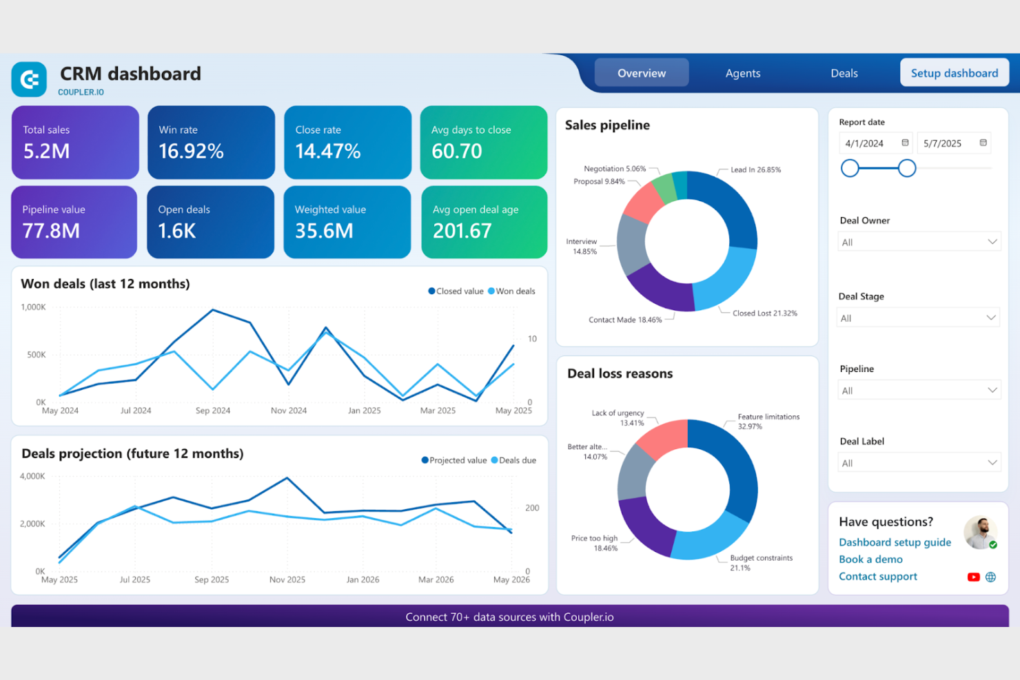
Coupler.io is a data integration tool designed to automate data flows between apps and services for businesses of all sizes. It caters to users who need to consolidate data from various sources into a single destination for analysis and reporting.
Why I picked Coupler.io: It excels in data automation, allowing you to set up automatic data refreshes from multiple sources. You can schedule these updates to ensure your team always has access to the latest information. Coupler.io supports a variety of data sources, making it versatile for different business needs. In my experience, its simplicity and efficiency in automating data tasks are key benefits.
Standout features and integrations:
Features include automated data refreshes, scheduling capabilities, and support for multiple data sources. You can easily set up data flows without needing technical expertise. Coupler.io also provides detailed logs for monitoring data transfers.
Integrations include Google Sheets, Airtable, HubSpot, QuickBooks, Shopify, Pipedrive, Xero, Jira, BigQuery, Salesforce, and more.
Pros and cons
Pros:
- Easy to set up
- Multiple data source support
- Automated data refreshes
Cons:
- Complex for beginners
- Limited customization options
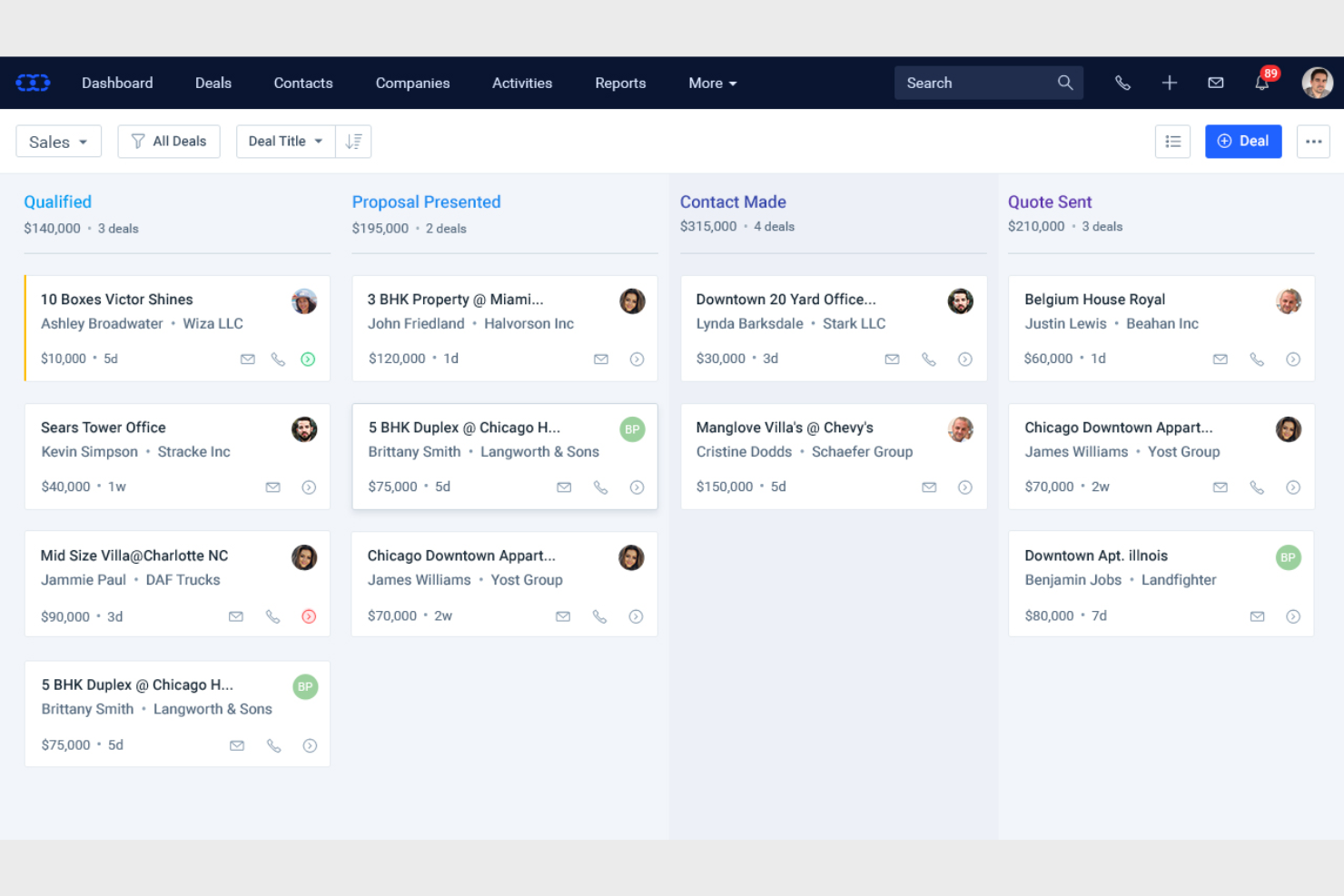
Salesmate is a customer relationship management (CRM) tool designed for small to medium-sized businesses looking to enhance their sales processes. It helps sales teams manage leads, automate workflows and sales reporting, and track customer interactions.
Why I picked Salesmate: It's tailored for small teams, offering features that simplify lead management and sales tracking. You can automate repetitive tasks, freeing up time for your team to focus on closing deals. Salesmate provides a user-friendly interface that makes onboarding quick and easy. In my experience, its affordability and feature set make it a great choice for smaller teams.
Standout features and integrations:
Features include lead management, sales automation, and email tracking. You can use Salesmate to streamline your sales pipeline and ensure no opportunity is missed. The tool also offers reporting features to help you analyze sales performance.
Integrations include Google Workspace, Microsoft Outlook, QuickBooks, Mailchimp, Zapier, Slack, Xero, Shopify, HubSpot, Pipedrive, and more.
Pros and cons
Pros:
- Feeds the sales pipeline
- Repetitive task automation
- Easy onboarding process
Cons:
- Advanced feature limitations
- Limited customization options
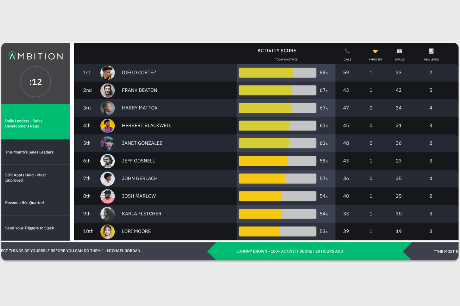
Ambition is a performance management and sales gamification platform designed for sales teams looking to drive engagement and conversion rates. It helps managers track performance metrics, set goals, and motivate team members through gamified experiences.
Why I picked Ambition: It excels in sales gamification, offering features such as leaderboards and contests that boost team morale. Your salespeople can engage in friendly competition, which can lead to improved performance. Ambition also provides performance tracking and real-time analytics to ensure your team meets its targets. These features make it a unique tool for energizing your sales team.
Standout features and integrations:
Features include leaderboards, contests, and performance tracking. Your team can benefit from real-time analytics to quickly assess progress. Ambition also offers goal-setting tools to keep everyone aligned and focused.
Integrations include Salesforce, Slack, Microsoft Teams, HubSpot, Gong, Outreach, SalesLoft, and more.
Pros and cons
Pros:
- Easy goal setting
- Real-time performance analytics
- Team gamification
Cons:
- May overwhelm new users
- Regular update requirements
Other Sales Dashboard Software
Here are some additional sales dashboard software options that didn’t make it onto my shortlist, but are still worth checking out:
- Everstage
For sales performance
- BC Toolbox
For ERP users
- Forecast
For sales forecasting
- Zoho Analytics
For data integration
- Domo
For business intelligence
- Wrike
For project management
- Highspot
For sales enablement


Sales Dashboard Software Selection Criteria
When selecting the best sales dashboard software to include in this list, I considered common buyer needs and pain points, such as data visualization and real-time reporting. I also used the following framework to keep my evaluation structured and fair:
Core Functionality (25% of total score)
To be considered for inclusion in this list, each solution had to fulfill these common use cases:
- Track sales metrics
- Visualize data trends
- Generate reports
- Monitor team performance
- Access real-time data
Additional Standout Features (25% of total score)
To help further narrow down the competition, I also looked for unique features, such as:
- Customizable dashboards
- Predictive analytics
- Mobile access
- Integration with CRM tools
- Gamification elements
Usability (10% of total score)
To get a sense of the usability of each system, I considered the following:
- Intuitive interface
- Ease of navigation
- Minimal learning curve
- Responsive design
- Customizable user experience
Onboarding (10% of total score)
To evaluate the onboarding experience for each platform, I considered the following:
- Availability of training videos
- Interactive product tours
- Use of templates
- Access to webinars
- Supportive chatbots
Customer Support (10% of total score)
To assess each software provider's customer support services, I considered the following:
- 24/7 availability
- Multiple support channels
- Responsiveness
- Quality of help resources
- Personalized assistance
Value for Money (10% of total score)
To evaluate the value for money of each platform, I considered the following:
- Competitive pricing
- Features offered for the price
- Flexible pricing plans
- Free trial availability
- Discounts for annual billing
Customer Reviews (10% of total score)
To get a sense of overall customer satisfaction, I considered the following when reading customer reviews:
- Overall satisfaction rating
- Commonly mentioned pros
- Commonly mentioned cons
- Feedback on customer support
- Value for money perception
How to Choose Sales Dashboard Software
It's easy to get bogged down in long feature lists and complex pricing structures. To help you stay focused as you work through your unique software selection process, here's a checklist of factors to keep in mind:
| Factors | What to Consider |
|---|---|
| Scalability | Will the tool grow with your team? Consider if it can handle increasing data volume and user count without performance issues. Look for scalable pricing plans that fit future growth. |
| Integrations | Does it integrate with your existing tools? Check compatibility with your CRM, email, and other critical software. Avoid manual data transfers that waste time. |
| Customizability | Can you tailor the dashboards to fit your needs? Look for custom fields, layouts, and reporting options that align with your workflow. |
| Ease of Use | Will your team adopt it quickly? Evaluate the user interface and navigation. A steep learning curve can delay implementation and reduce productivity. |
| Implementation and Onboarding | How long will it take to get up and running? Assess the resources needed for setup and training. Seek solutions with comprehensive onboarding support and resources. |
| Cost | Is the pricing transparent and within budget? Compare costs across competitors, including any hidden fees. Consider the total cost of ownership over time. |
| Security Safeguards | Are your data and privacy protected? Ensure the tool complies with industry standards and offers encryption, access controls, and regular security updates. |
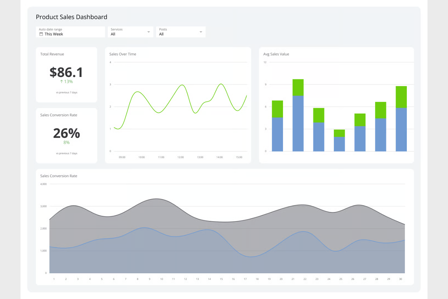
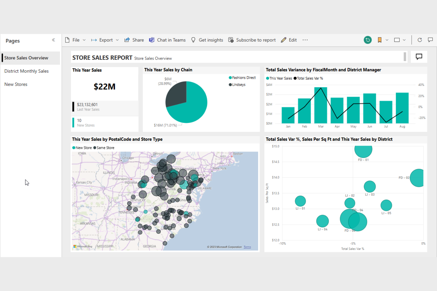
What Is Sales Dashboard Software?
Sales dashboard software is a tool that visualizes sales data to help teams track performance and make informed decisions. Sales managers, analysts, and executives typically use these tools to gain insights into sales trends and team productivity. Real-time data, customizable dashboards, and integration capabilities help monitor metrics and enhance decision-making. Overall, these tools simplify data analysis and support strategic planning.
Features
When selecting sales dashboard software, keep an eye out for the following key features:
- Real-time data access: Provides up-to-the-minute data to help teams make timely decisions and react quickly to changes.
- Customizable dashboards: Allow users to tailor their dashboards to display relevant metrics and insights according to specific needs.
- Integration capabilities: Connects with existing tools such as CRM, email, and analytics platforms to streamline data flow and reduce manual input.
- Data visualization: Transforms complex data into easy-to-understand charts and graphs, making insights more accessible.
- Automated reporting: Generates reports automatically to save time and ensure consistency in data presentation.
- Goal tracking: Helps teams set and monitor sales targets, providing visibility into progress and areas needing improvement.
- User-friendly interface: Ensures ease of use with intuitive navigation, reducing the learning curve for new users.
- Mobile access: Offers the ability to view dashboards and data on mobile devices, keeping teams informed on the go.
- Security safeguards: Protects sensitive sales data with encryption and access controls, ensuring compliance with industry standards.
- Predictive analytics: Uses historical data to forecast future trends, aiding in strategic planning and decision-making.
Benefits
Implementing sales dashboard software provides several benefits for your team and your business. Here are a few you can look forward to:
- Improved decision-making: Real-time data and automated reports help your team make informed decisions quickly.
- Increased productivity: Automated reporting and integration capabilities reduce manual tasks, allowing your team to focus on selling.
- Enhanced visibility: Customizable dashboards and data visualization provide clear insights into sales performance and trends.
- Better goal tracking: Goal tracking features keep your team aligned with targets, ensuring everyone knows where they stand.
- Greater flexibility: Mobile access and user-friendly interfaces let your team access information anytime, anywhere, keeping them informed on the go.
- Data security: Security safeguards protect sensitive sales data, giving you peace of mind about data privacy.
- Predictive insights: Predictive analytics offer foresight into future trends, aiding in proactive planning and strategy.
Costs & Pricing
Selecting sales dashboard software requires an understanding of the various pricing models and plans available. Costs vary based on features, team size, add-ons, and more. The table below summarizes common plans, their average prices, and typical features included in sales dashboard software solutions:
Plan Comparison Table for Sales Dashboard Software
| Plan Type | Average Price | Common Features |
|---|---|---|
| Free Plan | $0 | Basic data visualization, limited integrations, and real-time updates. |
| Personal Plan | $5-$25/user/month | Customizable dashboards, email support, and basic reporting features. |
| Business Plan | $30-$60/user/month | Advanced analytics, multiple integrations, and enhanced security features. |
| Enterprise Plan | $70-$120/user/month | Predictive analytics, dedicated support, and comprehensive customization options. |
Sales Dashboard Software FAQs
Here are some answers to common questions about sales dashboard software:
How do I know which sales dashboard software is right for my team?
Start by identifying your team’s specific needs and goals. Consider factors such as integration with existing tools, ease of use, and customization options. Trial periods can also help you test functionality before committing. Match the software’s strengths to your team’s workflows and challenges. Gather feedback from potential users within your team to ensure it aligns with their daily tasks and preferences.
Can sales dashboard software integrate with my existing CRM?
Yes, most sales dashboard software options offer integration with popular CRMs, such as Salesforce, HubSpot, and Microsoft Dynamics. Check the software’s integration capabilities on its website or consult with a sales representative. Successful integration can enhance data flow and provide a more comprehensive view of sales activities, helping your team make informed decisions.
Is training required to use sales dashboard software effectively?
Yes, training is often required to maximize the benefits of sales dashboard software. Many providers offer resources such as tutorials, webinars, and user guides to help your team get started. Investing time in training can improve user adoption and ensure your team leverages the software’s features fully. Consider choosing software with strong customer support to assist with onboarding.
How secure is sales dashboard software?
Sales dashboard software typically includes security measures, such as data encryption, user authentication, and access controls. However, it’s crucial to verify that the software complies with industry standards and regulations relevant to your business. Ask about the provider’s security protocols and any additional measures they take to protect your data. This ensures peace of mind regarding data privacy and security.
What's Next:
If you're in the process of researching sales dashboard software, connect with a SoftwareSelect advisor for free recommendations.
You fill out a form and have a quick chat where they get into the specifics of your needs. Then you'll get a shortlist of software to review. They'll even support you through the entire buying process, including price negotiations.